
HP 39gs_40gs_Mastering The Graphing Calculator_English_E_F2224-90010


Alternatively, when data is non-linear in nature you can transform the data mathematically so that it is linear.
Let's illustrate this briefly with exponential data.
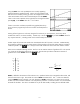
As you can see, I chose a very simple rule for the data of
y
=
2
x
.
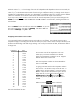
If you set up a linear fit for the data in
S1, and then view the bivariate
stats, you will find that the correlation for a linear fit is 0.9058
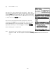
As you can easily see from the graph left, a linear fit is not a very good
choice.
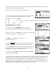
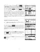
If we change now to the
SYMB SETUP view and choose an
Exponential fit rather than a linear fit then the results are far better.
The curve which results in the
PLOT view is exactly what is required and
1
the equation comes out as
Y =⋅EXP (0.693147 X )
1
0.693147
X
This “
EXP(“ is the calculator’s notation for
Y =⋅e
which then changes to
Y = 2
X
.
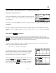
key shows that the correlation is unchanged at
0.9058 even when the new equation clearly fits the data perfectly.
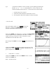
Checking the
The value of
RelErr on the other hand has changed from 0.09256 for
the linear fit, to a value very close to zero for the exponential model
(rounding error may result in something non-zero).
The alternative to using
RelErr is to graph column C1 against ln(C2)
which also straightens the data.
‘Linearizing’ will cause problems if some of the data points are outside the domain of the function you use,
such as negative values in a log function. On the other hand, you have far more control if you are able to
choose the exact function. For example, if you had a set of data which was derived from cooling
temperatures then you would probably find that it was asymptotic to room temperature rather than the x-axis.
The built-in equation assumes that the data is asymptotic to the x axis and would not give a good fit. You
could get better results by subtracting a constant from the whole column first.
132