
HP OneView 1.05 User Guide


26.4 Using the Dashboard screen
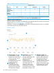
26.4.1 About the Dashboard
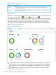
The Dashboard provides a graphical representation of the general health and status of several
managed resources in your data center. From the Dashboard, you can immediately see resources
that need your attention. For direct access to resources needing your attention, select the resource
name.
Each time you log in to the appliance, the Dashboard is the first screen you see. Select Dashboard
from the main menu any time you want to see the dashboard graphs.
Only those resources you are authorized to view or to manage appear on the Dashboard.
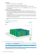
26.4.2 Dashboard screen details
Hover your pointing device on a graph slice to view the count of resource instances being
represented by that slice. Hovering you pointing device on a graph slice changes the text and
count displayed in the center of the graph.
The following graphs appear on the Dashboard:
DescriptionGraph name
A Status graph summarizes the health status of a particular resource.
The number displayed next to the resource name indicates the total number of instances of that
resource that are known to the appliance. To learn more, click the resource name to display its
main screen to see a full picture of resource health and status.
On a Status graph, a dark gray color indicates the number of resources that are not reporting
information because they are either disabled or are not being managed by the appliance.
To filter the view of a resource based on its status, click the status icon.
To learn more about health status and severity icons, see “Icon descriptions” (page 62).
Status
The default view of the Servers with profiles graph reports the count of server hardware instances
with assigned server profiles.
If the graph is not solid blue, hover your pointing device on the light gray graph slice to see the
count of servers without profiles.
Servers with profiles
for Server
Hardware
The default view of the Populated blade bays graph reports the count of server hardware instances
in all managed enclosure bays.
If the graph is not solid blue, hover your pointing device on the light gray graph slice to see the
count of empty blade bays.
Populated blade
bays for Enclosures
26.4.3 How to interpret the Dashboard graphs
Dashboard graph colors provide a quick way to visually interpret the data being reported.
Table 12 Dashboard graph colors
IndicationColor
A healthy statusGreen
An event has occurred that might require your attentionYellow
A critical condition that requires your immediate attentionRed
The percentage of resource instances that match the data being measured (a solid blue graph
indicates 100%)
Blue
26.4 Using the Dashboard screen 193