
HP StorageWorks Enterprise File Services WAN Accelerator 3.0.4 Management Console user guide (AG421-96002, March 2007)

HP STORAGEWORKS EFS WAN ACCELERATOR MANAGEMENT CONSOLE USER GUIDE 151
3 CREATING HP EFS WAN
A
CCELERATOR REPORTS AND
How much optimization occurred through disk hits?
How much optimization occurred through memory hits?
How much data traversed the WAN without optimization?
About Report
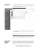
Graphs
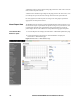
In bar-graph and line-graph reports, the x-axis (or tick mark) plots time, according to
the interval you select. The y-axis plots the metric of interest, such as gigabytes (GB)
of bandwidth, percent (%) of data reduction, connection counts, and the like.
A diamond icon above the top margin of the graph points to the value on the x-axis (the
time) at which the peak occurred.
A diamond icon outside the right margin of the graph points to the value on the y-axis
(for example, the percent) that is the average value for the time period selected.
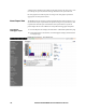
Pie chart graphs do not indicate peaks or averages. Pie chart graphs represent the
aggregate for the time period selected.
About Report Data The HP EFS WAN Accelerator system polls bandwidth and connection metrics every
second and can report on performance for periods as long as one year. However, due
to performance and disk space considerations, data representation in reports for
periods longer than the Last 5 Minutes are interpolated from aggregate data points.