
HP XP P9000 Performance Advisor Software v6.0 User Guide
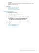
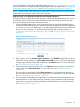
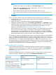

Figure 7 Dashboard screen
The Threshold Setting screen where you set the threshold levels.1
The XP/P9000 Array Health section, where status icons are
displayed that indicate the overall usage of the XP and the P9000
disk arrays in a particular category.
2
The Statistics section, where the average usage summary of
individual components are displayed. You can plot their usage
graphs in the Chart Work Area.
3
The Chart Work Area, where graphs depicting the usage pattern
of individual components for selected metrics are displayed.
4
The Component Information section, where the busiest and least
busiest components are displayed. These components are
5
associated with the corresponding port, RAID group, or MP blade
selected in the Statistics section. You can plot their usage graphs
in the Chart Work Area.
Related Topics
• “Configuring dashboard threshold settings” (page 97)
• “Specifying the top 20 consumers” (page 99)
• “Dashboard threshold metrics” (page 100)
• “Viewing dashboard” (page 103)
96 Monitoring performance of XP and P9000 disk arrays