To use the speech shortcut: Select Menu. The Speech shortcut appears in the Quick Menu. Select the shortcut to toggle speech on or off. When Speech is ON, each word is spoken as you select it. When you select the message window, the entire message is spoken. When Speech is OFF, words are not spoken as you select them. When you select the message window, the entire message is spoken. Note: To speak messages, Speak Message Window must be turned on in the Message Window Settings. 1.
Changing the Appearance of the Multi-bar To modify the multi-bar, select User Settings > Message Window & Multi-bar > Multi-bar. Show Positioning Guide Turn Show Positioning Guide on or off. When Show Positioning Guide is turned on, a miniature version of the positioning guide is displayed in the multi-bar to help you use eye tracking and head tracking. In addition, this can be used to pause and resume eye tracking with the touch of a finger. Symbol Buffer Turn Symbol Buffer on or off.
Working with Users Users allow you to save collections of settings configured for specific users. When multiple users use the same device, you can sign out one user and select another user. For example, an evaluator may create a user for an adult with amyotrophic lateral sclerosis (ALS) or a child using eye tracking. The Sign in page allows you to create users, switch between users, delete users, and exit the application. Signing in Each time you open the application, the Sign In page is displayed.
Creating a New User To create a new user, you first need to sign out the current user. 1. Select Menu > Toolbox > User Settings > Users. 2. Select Sign Out. The Sign In page opens. 3. Select New User. You will be prompted to create a new user. 4. Select the Username box, use the keyboard to enter a user name, and select Finished. The name you enter will appear in the Username box.
Deleting Users 1. Select Menu > Toolbox > User Settings > Users. 2. Select Sign Out. The Sign In page opens. 3. When necessary, use the arrows to move between pages of users. 4. Select the Delete button for the user you want to delete. 5. Select OK at the confirmation prompt. Closing the Application To close the application: 1. Select Menu > Toolbox > User Settings > Users. 2. Select Sign Out. The Sign In page opens. 3. Select Exit Software.
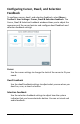
Configuring Cursor, Dwell, and Selection Feedback To configure cursor, dwell, and selection feedback, select Menu > Toolbox > User Settings > Cursor, Dwell & Selection Feedback. The Cursor, Dwell & Selection Feedback window allows you to adjust the appearance of the cursor/pointer and configure dwell feedback and selection feedback settings. Cursor Use the cursor settings to change the look of the cursor to fit your needs.
Configuring the Cursor Use the cursor settings to change the look of the cursor to fit your needs. Select Menu > Toolbox > User Settings > Cursor, Dwell & Selection Feedback > Cursor. The Settings tab on the left is selected by default. Cursor Toggle the cursor on or off by selecting the on/off toggle. Select Cursor When the cursor is turned on, select the arrow pointer or hand pointer. Cursor Size When the cursor is turned on, adjust the size of the cursor.
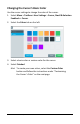
Changing the Cursor’s Basic Color Use the cursor settings to change the color of the cursor. 1. Select Menu > Toolbox > User Settings > Cursor, Dwell & Selection Feedback > Cursor. 2. Select the Colors tab on the left. 3. Select a basic color or custom color for the cursor. 4. Select Finished. Hint: To create your own colors, select the Custom Color button and follow the instructions under “Customizing the Cursor’s Color” on the next page.
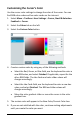
Customizing the Cursor’s Color Use the cursor color settings to change the color of the cursor. You can find RGB color codes and hex color codes on the internet. 1. Select Menu > Toolbox > User Settings > Cursor, Dwell & Selection Feedback > Cursor. 2. Select the Colors tab on the left. 3. Select the Custom Color button. 4. Create a custom color by using any of the following methods. • Select the Red, Green, or Blue field, use the keyboard to enter a new RGB value, and select Finished.
7. Select Save Color. The New Color/Current Color box will show your custom color. 8. When you finish changing colors, select Finished. Note: Your new color(s) also appear under Custom Colors in the basic colors window to select for future use.
Configuring Dwell Feedback Settings Use the dwell feedback settings to adjust how the system reacts when you dwell on a button. Select Menu > Toolbox > User Settings > Cursor, Dwell & Selection Feedback > Dwell Feedback. The Feedback Type tab on the left is selected by default. The preview box shows how the selections you make will look. Selecting a Dwell Feedback Pointer To set the type of pointer that will appear when you dwell on a button, select None, Circle, or Square.
Adjusting the Dwell Feedback Pointer Size Adjust the size of the selected pointer by either moving the slider button or selecting the + and – buttons to increase or decrease the number one increment at a time. Settings range from 1 to 10. Adding Animation to a Dwell Pointer None The circle or square will not change as you dwell on a button. Shrink The circle or square will first appear at the size you set and then shrink as you dwell on a button.
Changing Dwell Feedback Basic Colors 1. Select Menu > Toolbox > User Settings > Cursor, Dwell & Selection Feedback > Dwell Feedback. 2. Select the Colors tab. Tabs will only appear at the top of this window if you selected a pointer and a dwell feedback type from the Feedback Type tab. In this example, Pointer and Border tabs are available because Pointer and the Border dwell feedback type were selected. 3.
Customizing Dwell Feedback Colors You can find RGB color codes and hex color codes on the internet. 1. Select Menu > Toolbox > User Settings > Cursor, Dwell & Selection Feedback > Dwell Feedback. 2. Select the Colors tab. Tabs will only appear at the top of this window if you selected a pointer and a dwell feedback type from the Feedback Type tab. In this example, Pointer and Border tabs are available because Pointer and the Border dwell feedback type were selected. 3.
4. Create a custom color by using any of the following methods. • Select the Red, Green, or Blue field, use the keyboard to enter a new RGB value, and select Finished. If applicable, repeat for the other RGB fields. The Hex Code and color slider values will change accordingly. • Select the Hex Code field, use the keyboard to enter a new hex value, and select Finished. The RGB and slider values will change accordingly. • Move the color gradient slider or move the cursor in the color gradient box. 5.
Selecting Dwell Feedback Sound Select Menu > Toolbox > User Settings > Cursor, Dwell & Selection Feedback > Dwell Feedback. Select Sound. Beep When Beep is turned on, you will hear a beep when you dwell on a button. Beep Volume When Beep is turned on, you can also adjust the volume of the beep. Adjust the beep volume by either moving the slider button or selecting the + and – buttons to increase or decrease the number one increment at a time. The number on the slider button will show the current setting.
Configuring Selection Feedback Settings Use the selection feedback settings to configure how the system shows that you have selected a button. Select Menu > Toolbox > User Settings > Cursor, Dwell & Selection Feedback > Selection Feedback. The preview box shows how the selections you make will look. Selecting the Selection Feedback Type To set how a button will look when you select it, select None, Invert, Border, or Fill. If you select Border or Fill, the Colors tab is available.
Beep Volume When Beep is turned on, you can also adjust the volume of the beep. Adjust the beep volume by either moving the slider button or selecting the + and – buttons to increase or decrease the number one increment at a time. The number on the slider button will show the current setting. Settings range from 1 to 5. Changing Selection Feedback Basic Colors 1. Select Menu > Toolbox > User Settings > Cursor, Dwell & Selection Feedback > Selection Feedback.
Customizing Selection Feedback Colors You can find RGB color codes and hex color codes on the internet. 1. Select Menu > Toolbox > User Settings > Cursor, Dwell & Selection Feedback > Selection Feedback. If you selected Border or Fill as the feedback type, the Colors tab is available. 2. Select the Colors tab. 3. Select the Custom Color button.
4. Create a custom color by using any of the following methods. • Select the Red, Green, or Blue field, use the keyboard to enter a new RGB value, and select Finished. If applicable, repeat for the other RGB fields. The Hex Code and color slider values will change accordingly. • Select the Hex Code field, use the keyboard to enter a new hex value, and select Finished. The RGB and slider values will change accordingly. • Move the color gradient slider or move the cursor in the color gradient box. 5.
Restricting Access to the Toolbox When you restrict access to the Toolbox, it is “locked”, preventing access to settings. A password or a file on a USB flash drive is required to “unlock” the Toolbox temporarily. To restrict access to the Toolbox, select Menu > Toolbox > User Settings > Restrictions. Restricting Access The Restrict Access to Toolbox settings operate as follows. Setting Description Off The Toolbox is unlocked.
Creating a File on a USB Flash Drive Use this procedure to create a file on a USB flash drive to lock or unlock the Toolbox. Recommendation: Create an unlock file even if you use a password to lock the Toolbox. You might forget or lose the password. 1. Select Menu > Toolbox > User Settings > Restrictions. 2. Select the Create USB Lock/Unlock Create button. You will be prompted to insert a USB flash drive. 3. Insert a USB flash drive in the device and select OK. 4.
Working with Vocabularies The Vocabulary screen provides access to features that allow you to • select or change your current vocabulary • turn on Vocabulary Builder to start with a few words and then grow vocabulary • modify vocabulary settings • modify, copy, and paste buttons using the Editor • customize vocabulary • set up word prediction and add or exclude predicted words • collect data to measure how an individual uses vocabulary To display the Vocabulary screen, select Menu > Toolbox >
Selecting a Vocabulary The Select Vocabulary window lists the vocabularies available on your device. As you customize vocabularies, they are automatically saved and listed under My Vocabularies. 1. Select Menu > Toolbox > Vocabulary > Select a Vocabulary. The Select a Vocabulary window lists available vocabulary language systems and highlights the current language system or My Vocabularies. When My Vocabularies is highlighted, a customized vocabulary is the current vocabulary. 2. Select a language system.
3. When the list includes more than one page, use the paging arrows to move between the pages. 4. Select the Choose button for the vocabulary you want to open. Note: To delete a vocabulary, select the delete icon vocabulary you want to delete. for the 5. Select Finished. The vocabulary you selected is now active. Creating a New Vocabulary 1. Select Menu > Toolbox > Vocabulary > Select Vocabulary > My Vocabularies. 2. Select Create New. 3. Select the Name your Vocabulary box to display a keyboard.
4. Define the number of buttons for the vocabulary by using the Rows and Columns + and – buttons. 5. If you want the vocabulary layout to include an activity window, turn on Include Activity Window. 6. Select Create and Edit. A message indicates that the vocabulary was created successfully and the vocabulary layout you defined opens in the Editor. 7. Use the Editor features to add content to your page.
Using Vocabulary Builder Vocabulary Builder is a therapeutic tool designed to teach new vocabulary by creating and managing word lists. Show only the words you want and hide the rest. This allows the user to build his or her vocabulary gradually while keeping learned motor plans consistent. As the user is ready to learn more vocabulary, gradually add more words to your list so they are visible. Note: Vocabulary Builder works with Unity vocabularies and LAMP Words for Life vocabularies only.
Turning Vocabulary Builder On from the Quick Menu Hint: For another way to turn Vocabulary Builder on, see “Turning Vocabulary Builder on from the Toolbox” on page 133. Select Menu to display the Quick Menu. Select Vocabulary Builder. Select the on/off toggle to turn Vocabulary Builder on. Button / Description The on/off toggle turns Vocabulary Builder on or off. The name of the current word list is displayed to the right of the button. Edit List Create, rename, manage, and clear word lists.
Creating a Word List by Selecting Words to Show With Vocabulary Builder turned on from the Quick Menu, decide if you want to start with all words hidden or all words shown. Select Hide All or Show All. For example: 1. Select Hide All. The following confirmation prompt will appear. 2. Select Okay. All the buttons on the page will be hidden. 3. Select each button you want to make visible. • In a sequenced vocabulary, select the linked buttons that lead to each word that you want to make visible.
5. When the individual learns these words and you want to add more, turn on Vocabulary Builder and select the words you want to add. Hint: You can also add words by selecting Edit List and entering words. 6. To show all buttons on the page, do one of the following. • Turn off Vocabulary Builder. When you want to limit the display, turn Vocabulary Builder back on. If you created more than one word list, select the list you want to use. • With the word list displayed, select Show All.
Creating a Word List by Entering Words 1. From the Quick Menu, select Edit List. (From the Vocabulary Builder window, select the text entry field to open the keyboard.) 2. Enter a word or multiple words separated by commas. 3. Select Finished. A message will confirm that the words were added. 4. Select Okay to close the message. The words will be listed below the text entry field with the path to each word. 5. Add more words as needed.
Managing Word Lists From the Quick Menu, select Change List. (From the Vocabulary Builder window, select Manage Lists.) The Manage Lists window opens to the My Lists tab. My Lists: My Lists contains customized word lists. The currently selected word list shows a checkmark. Default Lists: To view 25 First Words, 50 First Words, activity-specific lists, and other default lists, select the Default Lists tab. Buttons are available for each list.
Making a Word List Active 1. From the Quick Menu, select Change List. (From the Vocabulary Builder window, select Manage Lists.) The Manage Lists window lists all available word lists. The currently selected word list shows a checkmark. 2. Select the Load button for the list you want to make active. The Load button will change to a checkmark. 3. Select Finished. When you go to your vocabulary, only the words in the active word list will be displayed.
Merging Two or More Word Lists 1. From the Quick Menu, select Change List. (From the Vocabulary Builder window, select Manage Lists.) 2. From the Manage Lists window, select Merge Lists. A checkbox precedes each list. 3. Select the lists you want to merge. The Merge Lists button shows the number of lists you selected. 4. Select Merge (2) Lists. The merged list will appear in the Manage Lists window. 5.
Temporarily Enlarging a Button When teaching an individual to use a button, use the Button Boost shortcut to temporarily enlarge the button to make it easier to select. 1. Select Menu to display the Quick Menu. 2. Select Vocabulary Builder and select the on/off toggle to turn Vocabulary Builder on. 3. Select Button Boost. The Button Boost button turns blue. 4. Select the button you want to enlarge. The button enlarges to three times its original size.
As long as Button Boost remains selected (blue) you can select additional buttons to enlarge them. To toggle Button Boost off, select Button Boost again. Any enlarged buttons will remain enlarged. Selecting Exit Menu or any other Quick Menu feature will save the buttons that are currently enlarged. Hints on Using Button Boost • When you temporarily enlarge a button, it does not delete the buttons it covers. • If you enlarge buttons that are close to each other, they may overlap.
Turning Vocabulary Builder on from the Toolbox Select Menu > Toolbox > Vocabulary > Vocabulary Builder. Select the on/off toggle to turn Vocabulary Builder on. Feature / Description Turn Vocabulary Builder on or off. List Name/ Change The name of the current word list is displayed. Select Change to open a keyboard and change the name. Type Words Enter words, separated by commas, that you want to hide. These words will be added to the current word list.
Using Word Finder When you don’t know where a word is located in a Unity or LAMP Words for Life vocabulary, use Word Finder to search for the word. 1. From your vocabulary, select the keyboard button to open the keyboard. 2. Select Word Finder. “Find this word” appears at the top of the keyboard.
3. Enter the word you want to find. As you enter letters, predicted words are displayed. If you see the word you want, select it. It will appear after “Find this word”, eliminating the need for you to enter the entire word. 4. Select Search. The Search Result window will show one or more matching sequences for the word. Hint: If you need help learning a sequence, select Guide Me. The software will step you through the sequence by highlighting the first key in the sequence.
Customizing Settings for a Vocabulary To customize settings for a specific vocabulary, you can • change the home page, software language, and vocabulary screen mode • modify the font and font size • modify the background colors • set your preferences for button appearance and actions Select Menu > Toolbox > Vocabulary > Vocabulary Settings. The settings window for the current vocabulary opens to the Button Preferences tab.
Empty Button Action If you select No Action, nothing will happen when you select an empty button. If you select Go to Home, selecting an empty button will take you to your home vocabulary page. If the empty button is in the activity window, selecting it will take you to the home activities. Show Labels If you select Home, only the home screen buttons will display a label. If you select Middle, the button in the middle of a path to a word will display a label.
Button Padding Set the amount of empty space that separates buttons from each other. To change the padding, move the slider or use the + and – buttons to select the percentage you want. Set the percentage in increments of 4 from 0% to 40%. The amount of padding will increase or decrease consistently and be the same around all buttons. Button sizes will change proportionately.
Changing the Font and Font Size 1. Select Menu > Toolbox > Vocabulary > Vocabulary Settings. 2. Select the Edit Fonts & Styles tab. The current font is highlighted. 3. If appropriate, select a different font. 4. To change the font size, move the slider or use the + and – buttons to select the size you want. Available sizes are S (small), M (medium), L (large), and XL (extra large). 5. Select Finished.
Changing Background Basic Colors 1. Select Menu > Toolbox > Vocabulary > Vocabulary Settings. 2. Select the Edit Colors tab. 3. Select either Home Background or Activity Window Background. 4. Select a basic or custom color for the selected background. You can apply the same color to both or different colors to each. Hint: To create your own colors, select the Custom Color button and follow the instructions under “Customizing Background Colors” on the next page. 5. Select Finished.
Customizing Background Colors 1. Select Menu > Toolbox > Vocabulary > Vocabulary Settings. 2. Select the Edit Colors tab. 3. Select either Home Background or Activity Window Background. 4. Select the Custom Color button. 5. Create a custom color by using any of the following methods. • Select the Red, Green, or Blue field, use the keyboard to enter a new RGB value, and select Finished. If applicable, repeat for the other RGB fields. The Hex Code and color slider values will change accordingly.
Renaming a Vocabulary 1. Select Menu > Toolbox > Vocabulary > Vocabulary Settings. 2. Select the Settings tab. 3. Select the Vocabulary Name field and use the keyboard to enter a new name. 4. Select the keyboard Finished button. The new name will appear in the Vocabulary Name field. 5. Select Finished.
Changing Your Home Page 1. Select Menu > Toolbox > Vocabulary > Vocabulary Settings. 2. Select the Settings tab. 3. Select the Home Page Change button. A list of available pages in the current vocabulary opens. 4. Use the arrows to scroll through the pages. 5. Select Choose for the page you want. 6. Select Finished.
Changing the Language Used with Vocabularies This setting changes the language used with vocabularies. To change the toolbox language, see “Changing the Toolbox Language” on page 58. 1. Select Menu > Toolbox > Vocabulary > Vocabulary Settings. 2. Select the Settings tab. 3. Select the Current Language Change button. 4. Select Choose for the language you want. 5. Select Finished.
Expanding Vocabulary Buttons to Fill the Entire Screen Use the full-screen option to expand vocabulary buttons to fill the entire screen, covering the message window and multi-bar. 1. Select Menu > Toolbox > Vocabulary > Vocabulary Settings. 2. Select the Settings tab. 3. Select the Display as Full Screen on/off toggle. Vocabulary pages will be displayed with the message window and multi-bar. Vocabulary pages will be displayed in full-screen mode. 4. Select Finished.
Choosing the More Button Location in the Activity Window Use the More Button Location setting to locate the More button on the left or right end of the activity window. 1. Select Menu > Toolbox > Vocabulary > Vocabulary Settings. 2. Select the Settings tab. 3. Select the More Button Location Left or Right button. 4. Select Finished.
Using the Editor The Editor allows you to modify a vocabulary. When you make a change to a vocabulary and save it, the modified vocabulary is saved in My Vocabularies, which you can open from Menu > Toolbox > Vocabulary > Select a Vocabulary > My Vocabularies. The original default vocabulary is preserved and is still available.
Using the Editor Buttons When you select an Editor button, it turns blue to indicate it is active. The button will remain active—indicated by the blue highlight—until you select it again or until you finish making changes and select Save. As long as a button remains active you can perform that operation on multiple buttons, one after another. Operations of the Editor Buttons Button Description Page Settings Rename the current page. Select Page Settings, select the Page Name field to open a keyboard.
Button Description Undo Undo your most recent change. Return to home. Cancel Leave the current screen without saving your changes. You will be prompted to confirm what you want to do. Save Save the changes you made. Saving Changes When using the Editor, select Save after you make a change and verify that you want to keep the change. However, if you try to leave a screen without saving your changes, the following prompt will appear: Select the appropriate option to save or discard your changes.
Editing a Button 1. Do either of the following: • Open the Editor by selecting Menu > Toolbox > Vocabulary > Editor. Once you are looking at the button you want to edit, select Edit. The “Edit” button changes color. Select the button you want to modify. • Open the Editor by selecting Menu > Editor. Once you are looking at the button you want to edit, select Edit. The “Edit” button changes color. Select the button you want to modify. 2. Using either method, the Edit Button window opens.
3. Select tabs to make the changes you want. Message: Change a button’s message and label. When you enter message or label text, the software will suggest symbols you might want to use for the button. Colors: Change the color of a button or its background, border, symbol background, label background, or font color. Symbol: Change a button’s symbol, import symbols, or take a photo with the device’s camera. Navigation: Add a navigation action to a button. Actions: Add an action to a button.
Changing a Button’s Message, Label, and Symbol Select Menu > Editor. Then select Edit and choose the button you want to modify. The Edit Button window opens to the Message tab. To add or change a message: Select the Message field to open a keyboard. Enter a word or phrase that will be spoken when the button is selected and select the keyboard Finished button. To add or change a label: Select the Label field to open a keyboard. Enter a label for the button and select the keyboard Finished button.
To replace the button’s symbol with a photo: 1. Select the Camera icon . 2. Select Take Picture. A preview of the photo appears in the camera window and the button preview. Try Again replaces the Take Picture button. Note: If you’re not satisfied with the picture, select Try Again and then select Take Picture again. 3. When you’re satisfied with the picture, select Finished. The photo will appear on the button. Note: You can also take a photo from the Symbol tab.
Finding a Different Symbol for a Button To search for, browse for, or import a symbol for a button, select Menu > Editor. Select Edit and choose the button you want to modify. The Edit Button window opens to the Message tab. Select the Symbol tab. To search for a symbol by name or description: 1. Select the Search Symbols tab at the top of the window and select the Search for symbols field. A keyboard opens. 2. Enter a symbol name or description and select Finished to display available symbols.
To browse for a symbol: 1. Select the Browse Symbols tab at the top of the window. A list of categories opens. Button preview Hint: When multiple pages of categories are available, use the arrows to page through the categories. 2. Select a category. If a list of subcategories opens, select a subcategory. A list of specific symbols opens.
To import a symbol: 1. Select Import Symbols tab at the top of the window. A list of folders opens. Hint: If necessary, use the Up One Level button to navigate to a different location. If multiple pages of image folders are available, use the arrows to page through the folders. 2. Select a folder to display the symbols in the folder. Button preview 3. Select a symbol to open a preview image that you can rotate. If necessary, select the preview image one or more times to rotate it. 4. Select Accept.
Taking a Picture to Use on a Button The device front and rear cameras allow you to take pictures to use on buttons. These pictures help personalize an individual’s communication. For example, a picture of the individual’s mom could be used on a “Mom” button. To take a picture to use on a button, select Menu > Editor. Once you are looking at the button you want to edit, select Edit. Choose the button you want to modify. 1.
Changing a Button’s Basic Colors When changing a button’s colors, you can apply basic colors to any or all of the following: the entire button, its outline, font, label, symbol, and background. If you prefer to create your own colors, see “Customizing a Button’s Colors” on the next page. 1. Select Menu > Editor. 2. Select Edit and choose the button you want to modify. 3. Select the Colors tab on the left. 4. Select the applicable tab at the top of the window.
Customizing a Button’s Colors When changing a button’s colors, you can customize the colors of any or all of the following: the entire button, its outline, font, label, symbol, and background. When you create a custom color, it will appear under Custom Colors in the basic colors window to select for future use. You can find RGB color codes and hex color codes on the internet. 1. Select Menu > Editor. 2. Select Edit and choose the button you want to modify. 3. Select the Colors tab on the left. 4.
6. Create a custom color by using any of the following methods. • Select the Red, Green, or Blue field, use the keyboard to enter a new RGB value, and select Finished. If applicable, repeat for the other RGB fields. The Hex Code and color slider values will change accordingly. • Select the Hex Code field, use the keyboard to enter a new hex value, and select Finished. The RGB and slider values will change accordingly. Move the color gradient slider or move the cursor in the color gradient box. 7.
Changing the Page a Button Navigates to A navigation button takes you to another page or location in a vocabulary. You can change the page the button navigates to. 1. Select Menu > Editor. 2. Select Edit and choose the button you want to modify. 3. Select the Navigation tab on the left. 4. Select the Current Activity Choose button. A list of pages opens. 5. Search for the page you want and select Finished. A list of pages matching your search criteria is displayed.
Changing the Location a Button Navigates to A navigation button takes you to another page or location in a vocabulary. You can change the location the button navigates to. 1. Select Menu > Editor. 2. Select Edit and choose the button you want to modify. 3. Select the Navigation tab on the left. 4. Select the Remove Navigation Remove button. A list of navigation locations opens. 5. Select a different navigation location.
Setting up a Button to Navigate to a Website If you want to set up a button to take you directly to a specific website, do the following: 1. Select Menu > Editor. 2. Select Edit and choose the button you want to modify. 3. Select the Navigation tab on the left. 4. Select Go To App. Engage: Allows you to link the Engage app to the button. Browser: Allows you to link a browser and URL to the button. Windows Application: Allows you to link a Windows application to the button.
5. Select the Browser Choose button. Current App: Shows that you selected Browser as the Go To App option in the previous step. Go to URL: Shows the default URL or a URL you previously set up. Remove Navigation: Allows you to remove all navigation from the button. 6. Select the Go to URL Edit button. A keyboard shows the current URL. 7. On the keyboard, select Delete Word and enter the URL of the website you want. 8. Select the keyboard Finished button.
Setting up a Button to Navigate to a Windows Application If you want to set up a button to take you directly to a specific Windows application, do the following: 1. Select Menu > Editor. 2. Select Edit and choose the button you want to modify. 3. Select the Navigation tab on the left. 4. Select Go To App. Engage: Allows you to link the Engage app to the button. Browser: Allows you to link a browser and URL to the button. Windows Application: Allows you to link a Windows application to the button.
5. Select the Windows Application Choose button. A list of folders opens. Select a folder to display the Windows application options. Current App: Windows Application: Allows you to select a Windows application to link to the button. Go to Windows Application: Shows the Windows application currently selected and allows you to select a different application. Remove Navigation: Allows you to remove all navigation from the button. 6. Select the Go to Windows Application Edit button.
Removing a Button’s Navigation A navigation button takes you to another page or location in a vocabulary. You can remove all navigation from the button. 1. Select Menu > Editor. 2. Select Edit and choose the button you want to modify. 3. Select the Navigation tab on the left. 4. Select Go To App. 5. Select the Windows Application Choose button. 6. Select the applicable folder to display the Windows application options. 7. Select the Remove Navigation Remove button. A list of navigation locations opens. 8.
Changing or Removing an Activity Window Button’s Navigation 1. Select Menu > Editor. 2. Select Edit and choose the button in the activity window you want to modify. 3. Select the Navigation tab on the left. 4. To change the current page, select Choose and search for, select, or create a page. 5. To set the page to remain open after you make a selection, turn Make Persistent on. 6. To set the page to be displayed in the activity window, turn Show in Activity Window on. 7.
8. To change the navigation, select a different navigation location. • If you select Go To Page, a window will list available pages and activities. Choose the page or activity you want. Or create a new page. Then select Finished and Save. • If you select Go To App, a window will list apps available from the Menu > Toolbox > Applications. Select the location you want. Select Finished and Save.
Adding an Action to a Button Actions are commands you can add to a button to perform specific functions. You can add one or more actions to a button that will be initiated when the button is selected. 1. Select Menu > Editor. 2. Select Edit and choose the button you want to modify. 3. Select the Actions tab on the left. The Action List is displayed. 4. Select Add Action. Action categories are listed. Note: If you need to redisplay the Action List to see which actions you already selected, select Back. 5.
6. Select Choose for the action you want. The Action List shows the action you selected. 7. To select an additional action for the button, select Add Action and select Choose for another action. The Action List now shows both actions you selected. Note: Use the arrows to move an action higher or lower in the list. Select the delete button to delete an action from the button. 8. When you finish adding actions, select Finished and then select Save.
Adding a Delay between Button Actions When a button includes more than one action, you can add a delay between the actions and specify the delay time. The delay prevents other vocabulary buttons from being selected during the delay time. 1. Select Menu > Editor. 2. Select Edit and choose the button you want to modify. 3. Select the Actions tab on the left. The Action List is displayed. 4. Add an action. See “Adding an Action to a Button”. 5. Select Add Delay. The Delay Time window opens. 6.
7. Select Save. The delay time will appear on the Action List. 8. To move the delay in the Action List, use the up arrow arrow . To change a delay time, use the button. or down You can add multiple delay times to a button. For example: Hint: To create a delay time longer than 10 seconds, set a 10-second delay and add another delay immediately after it on the Action List. 9. Select Finished and select Save. “Successfully Saved” will appear.
Changing Button Message, Label, and Prompt Settings 1. Select Menu > Editor. 2. Select Edit and choose the button you want to modify. 3. Select the Settings tab on the left. 4. Select the Content Button Settings tab. Important! If you select the Button Types tab and then select Word Prediction or Morphological Prediction, these content button settings cannot be selected. Message Choose whether or not the message text will be displayed in the message window.
Alternate Pronunciation Change the pronunciation of the message. 1. Select the Alternate Pronunciation field. A keyboard opens. 2. Enter phonetic spellings for the words in the message. 3. Select Finished to display the text in the Alternate Pronunciation field. Select to hear the words. 4. Select Finished and select Save to save the phonetic pronunciation. Alternate Prompt If you are using auditory prompts, change the text that is spoken when the button is selected. 1. Select the Alternate Prompt field.
Content Set the button to select words normally. Word Prediction Set the button to predict the next word you want to speak. Morphological Prediction Set the button to predict the next word ending you want. If You Select Word Prediction or Morphological Prediction: If you select Word Prediction or Morphological Prediction, the Message, Symbol, Navigation, and Actions tabs and the content button settings cannot be selected.
Saving a Message to a Button Use the Save Message shortcut to save the message currently displayed in the message window to a button. Adding the Save Message Shortcut to the Quick Menu 1. Select Menu and then select Modify Shortcuts from the Quick Menu. 2. Select the space where you want the Save Message shortcut to appear. 3. Select the Save Message shortcut from the lower section of the menu. 4. Select Save.
Saving the Current Message to a Button Note: The Save Message shortcut will be darkened and not selectable if no message appears in the message window. 1. With the message displayed in the message window, navigate to the page that includes the button you want to use. 2. Select Menu and select the Save Message shortcut in the Quick Menu. You will be prompted to select where you want to save the message. 3. Select a button or empty button location. “Message Window Text: Successfully Saved” will appear.
Recording a Message to a Button 1. Edit a button: Either go to the Editor and select a button or rightclick a button and select Edit. 2. The Edit button window will open to the Message tab. 3. Add a label and symbol to the button. 4. Select the Actions tab and select Add Action. 5. Select Audio and then select Choose for Play Audio. Note: Playing the message is what the button will do when saved. 6. Select the Record Audio tab, enter a filename for the message, and select Finished. 7.
10. Select the play button to listen to your message. Select the pause button if necessary. If you are not satisfied with the message, select the Try Again button. 11. When you are satisfied with the message, select Save. 12. Record multiple messages to the button if want. Select Save for each message. When you finish recording messages or making changes to the button, select Finished. 13. Select Save to save all the messages to the button. 14.
To make changes to your messages: Your recorded messages will listed on the My Audio tab. The messages will play in the order in which they are listed from top to bottom. Move the message higher in the list so it will play before one or more of the other messages. Move the message lower in the list so it will play after one or more of the other messages. Change or replace the message. Delete the message from the Action List.
If you would like the message to appear in the Message Window, but not be spoken by the speech synthesizer: 1. Add a message in the Message tab. 2. In the Settings tab, turn the Speech off for this button.
Editing an Empty Button When a button has no content and the Editor is turned on, buttons that have no content appear with a black and white checkerboard pattern. If you select one of these empty buttons when Edit is highlighted in blue, you can add content to the button and make other changes. If you select one of these empty buttons when Edit is not highlighted in blue, the Editor - Empty button window opens.
Swapping, Resizing, Copying, and Moving Buttons The Editor Swap, Resize, Copy, Cut, and Paste buttons allow you to move and resize buttons. Swapping Buttons 1. Select Menu > Editor. 2. Select Swap. The Swap button turns blue to indicate it is active. Note: The Swap button will remain active until you select it again or until you finish making changes and select Save. 3. Select the first button; a red border will surround the selected button. 4. Select the second button.
Resizing a Button Important! When possible, only resize a button that has blank buttons or space around it. If you expand a button onto spaces that contain buttons, those buttons will be deleted permanently and you will not be able to use them. 1. Select Menu > Editor. 2. Select Resize. The Resize button turns blue, the vocabulary changes in appearance, and the prompt “Select a button you wish to resize” appears in the message window. 3. Select the button you want to resize.
6. If you continue, the button will fill the area you defined and any buttons you covered will be deleted. 7. Select Save. A message will confirm that your changes were saved. Copying and Moving Buttons To create a copy of a button: 1. Select Menu > Editor. 2. Select Copy. 3. Select the button you want to copy. 4. Select Paste. 5. Select the location to which you want to copy the button. 6. Select Save. To move a button to a different location: 1. Select Menu > Toolbox > Vocabulary > Editor. 2.
Resetting a Button to Its Factory Defaults When you want to remove all the changes you have made to a vocabulary button and return it to its original state, use the Reset Button feature to restore the button to its factory defaults. Important! If the button was linked, resized, swapped, cut, or copied, only that button will be restored to it original state. To restore the related buttons, reset each one individually. To reset a button to its factory defaults, select Menu > Editor.
Note: When Reset Button displays a light gray background, Reset Button is not available. This indicates that the button you selected is already at its default settings. Select Reset Button. A confirmation message appears. Select Okay and then select Save. “Successfully saved” will appear, and the button will be restored to its factory defaults.
Creating, Copying, Modifying, and Deleting Pages The Page Manager allows you to find, create, and modify pages. To open the Page Manager, select Menu > Toolbox > Vocabulary > Page Manager. The Page Manager window opens to the All Pages tab. To display only customized pages, select the My Pages tab. To display only default pages, select the Default Pages tab. Procedures for working with pages are the same on all three tabs.
Creating a New Page 1. Select Menu > Toolbox > Vocabulary > Page Manager. Select Add New. 2. Select the Name Your Page field, use the keyboard to enter a page name, and select Finished. 3. Define the number of buttons on the page by using the Rows and Columns + and – buttons. The number of buttons you define appears after “Current grid is”. 4. Select Create. The page you defined opens in the Editor. The page name appears in “Now Editing … page”. 5. Use the Editor features to add content to your page.
Copying a Page 1. Select Menu > Toolbox > Vocabulary > Page Manager. 2. To find the page you want from the list of pages, select the Search for Page field, use the keyboard to enter a partial page name, and select Finished. All page names with the characters you entered will be listed. 3. Find the page name you want. It will be displayed with copy, edit, and delete buttons. 4. Select the Copy button. 5. Select the Name Your Page field and enter a name for the new page. 6. Select Create.
7. Use the Editor features to modify your page. For example, select Edit, select a button, and change the message, label, symbol, and/or action and change the colors if you want. For details on using the Editor, see “Using the Editor” on page 147. 8. When you finish making changes or need to save your work in progress to come back to later, select Finished and then select Save. Note: Your new page is not linked to a button yet. Modifying a Page 1. Select Menu > Toolbox > Vocabulary > Page Manager. 2.