
User`s guide

Contents ▲ 220 ▼ Index
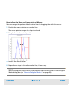
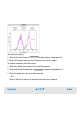
Using Dot Plots for Evaluation
On the Dot Plot tab, cells are displayed as dots, where their red fluorescence intensity is
mapped on the Y axis and their blue fluorescence intensity is mapped on the X axis.
NOTE
The lower left region of the dot plot area may show no events, because of the
threshold for event detection. Dots are only displayed if their fluorescence intensity
exceeds a minimum limit. The limits are specified in the assay—separately for red and
blue fluorescence.
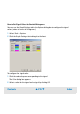
To evaluate the dot plots, you can add regions. Regions are rectangles that can be
changed in size and position until they include a specific event subset. As a result you get
the number of cells included in the region related to the total number of cells.
NOTE
You can add/remove regions and gates only in Generic assays.
Additionally, you can insert a horizontal or a vertical gate for one region. This is useful for
counting all cells that have fluorescence intensities within the horizontal or vertical
borders of the region. In predefined assays, the vertical side of a region corresponds to
the marker of the blue histogram, the horizontal side to the red one (see “Using
Histograms for Evaluation” on page 199). The gate is always displayed and corresponds
to the range of the marker that is used for gating. If you move a marker in a histogram, the
region and gate are automatically updated. If you change a region or gate, the marker is
also updated. Statistics are displayed in the result table below the dot plot.