
User Manual

Chapter 6 Creating Charts 135
Formatting the Elements in a Data Series
You can use a variety of visual effects to enhance the appearance of data series
elements.
To add data point labels:
1 Select the chart or an element in a data series.
For all chart types except pie charts, selecting one element (such as a bar) of a series
automatically selects the full series. For pie charts, you can select individual wedges.
2 In the Chart Inspector, click the Series button.
3 Choose Show Value from the Data Point Settings pop-up menu.
4 To specify the number of decimal places you want to display, type a number in the
Decimals field (or click the arrows to increase or decrease the number).
5 To change the position of data point values, choose an option from the Data Point
Settings pop-up menu.
6 Use the Font panel (Format > Font > Show Fonts) to choose a font, font size, and style
for the data point labels.
For pie charts, you can show data point labels as a percentage of the whole or as
absolute values by selecting or deselecting “Show Pie Values as Percentages” in the
Data Point Settings pop-up menu. You can also show the series names.
Some chart types offer further options for formatting series elements. See the
following sections for information about special formatting options for pie charts, bar
and column charts, line charts, scatter charts, and 3D charts.
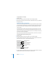
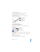
Place tick marks along
the Y-axis.
Show or hide the Y-axis
gridlines.
Show or hide value axis
labels.