
2


90 Chapter 6 Creating Charts
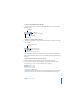
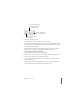
The colored squares next to the row labels (Region 1 and Region 2) show which color
represents each data series in the chart.
The illustration below shows how this data looks as a column chart.
In this chart, the data series are represented by rows in the Chart Data Editor. The
data points are represented as a series of dark-colored bars and a series of light-
colored bars.
Transposing Data Series and Data Sets
You can easily switch the data series and data sets in your charts—without having to
retype the data—by using the Plot Row vs. Column button in the Chart Data Editor.
These squares indicate which
color represents each data
series.
The data sets contain one
data point (one bar) from
each of the data series.
These four bars represent
one data series.
The chart legend denotes
the two data series.