
User`s guide


126 Chapter 6 Creating Charts
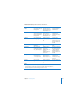
For this chart, the data series are represented by columns in the Chart Data Editor
pictured on page 124. There are now four data series represented as four different-
colored bars.
Data series are represented differently in the different kinds of charts provided by
Keynote.
 Column charts and bar charts: A data series is represented by a series of bars in the
same color (as shown above).
 Line chart (also called a graph): A data series is represented by a single line.
 Area chart: A data series is represented by an area shape.
 Pie chart: Only a single data set—the first data point in each series—is represented
on the chart (whichever is listed first in the Chart Data Editor).
 Scatter chart: Two columns of data are used to plot values for a single data series.
Each pair of values determines the position of one data point.
These two bars represent
one data series.
The data sets contain
one data point (one bar)
from each of the four
data series.