
User`s guide


134 Chapter 6 Creating Charts
To specify units for axis values:
1 Select the chart.
2 In the Chart Inspector, click the Axis button if it is not already selected.
3 Below Number Format, type text in the Prefix or Suffix field (or choose a symbol from
the pop-up menus).
Placing Grid Labels and Tick Marks
The X-Axis and Y-Axis pop-up menus in the Axis pane of the Chart Inspector provide
an array of options for placing tick marks, labels, and gridlines along the value axis or
the series axis. The options in these pop-up menus vary depending on the kind of
chart you select.
For vertical bar charts (column charts), line charts, and area charts, the Y-axis is the
value axis and the X-axis is the series axis; for horizontal bar charts, the X-axis is the
value axis. For scatter charts, both axes are value axes. For 3D charts, the X and Y axes
are the same as their 2D counterparts.
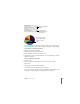
Pop-up menus are pictured below as they appear when a column chart is selected.
To add grid labels and tick marks along an axis:
1 Select the chart.
2 In the Chart Inspector, click the Axis button if it is not already selected.
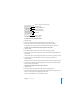
3 To add grid labels and tick marks along the X-axis, choose an option from the X-Axis
pop-up menu. The menu for a column chart looks like this:
4 To add grid labels and tick marks to the Y-axis, choose an option from the Y-Axis pop-
up menu. Here’s what the menu looks like for a column chart:
Place tick marks along
the X-axis.
Show or hide the
X-axis gridlines.
Set the text direction for
the series axis labels.
Show or hide series
axis labels.