
Owner manual


210 Chapter 9 Creating Charts
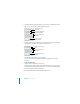
3 To add grid labels and tick marks along the X-axis, choose an option from the X-Axis
pop-up menu. The menu for a column chart looks like this:
4 To add grid labels and tick marks to the Y-axis, choose an option from the Y-Axis pop-
up menu. Here’s what the menu looks like for a column chart:
Formatting the Elements in a Data Series
You can use a variety of visual effects to enhance the appearance of data series
elements.
To add data point labels:
1 Select the chart or an element in a data series.
For all chart types except pie charts, selecting one element (such as a bar) of a series
automatically selects the full series. For pie charts, you can select individual wedges.
2 In the Chart Inspector, click the Series button.
3 Choose Show Value from the Data Point Label pop-up menu.
Place tick marks along
the X-axis.
Show or hide the
X-axis gridlines.
Set the text direction for
the series axis labels.
Show or hide series
axis labels.
Place tick marks along
the Y-axis.
Show or hide the Y-axis
gridlines.
Show or hide value axis
labels.