Chapter Statistical Graphs and Calculations This chapter describes how to input statistical data into lists, and how to calculate the mean, maximum and other statistical values. It also tells you how to perform regression calculations.
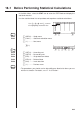
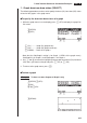
18-1 Before Performing Statistical Calculations In the Main Menu, select the STAT icon to enter the STAT Mode and display the statistical data lists. Use the statistical data lists to input data and to perform statistical calculations. Use f, c, d and e to move the highlighting around the lists. 1 2 3 4 5 6 P.285 1 (GRPH) .... Graph menu P.305 2 (CALC) ..... Statistical calculation menu 6 (g) ........... Next menu 6(g) 1 2 3 4 5 6 P.270 1 (SRT•A) .... Ascending sort P.270 2 (SRT•D) ...
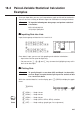
18-2 Paired-Variable Statistical Calculation Examples Once you input data, you can use it to produce a graph and check for tendencies. You can also use a variety of different regression calculations to analyze the data. Example To input the following two data groups and perform statistical calculations 0.5, 1.2, 2.4, 4.0, 5.2 –2.1, 0.3, 1.5, 2.0, 2.4 k Inputting Data into Lists Input the two groups of data into List 1 and List 2. a.fwb.cw c.ewewf.cw e -c.bwa.dw b.fwcwc.
18 - 2 Paired-Variable Statistical Calculation Examples • You can specify the graph draw/non-draw status, the graph type, and other general settings for each of the graphs in the graph menu (GPH1, GPH2, GPH3). • You can press any function key (1,2,3) to draw a graph regardless of the current location of the highlighting in the statistical data list. P.
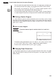
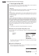
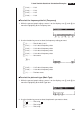
Paired-Variable Statistical Calculation Examples 18 - 2 1. Graph draw/non-draw status (SELECT) The following procedure can be used to specify the draw (On)/non-draw (Off) status of each of the graphs in the graph menu. u To specify the draw/non-draw status of a graph 1. While the graph menu is on the display, press 4 (SEL) to display the graph On/ Off screen. 1(GRPH) 4(SEL) 1 2 3 4 5 6 1 (On) .......... Graph On (graph draw) 2 (Off) .......... Graph Off (graph non-draw) 6 (DRAW)....
18 - 2 Paired-Variable Statistical Calculation Examples 2. General graph settings (SET) This section describes how to use the general graph settings screen to make the following settings for each graph (GPH1, GPH2, GPH3). • Graph Type The initial default graph type setting for all the graphs is scatter graph. You can select one of a variety of other statistical graph types for each graph.
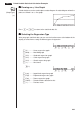
Paired-Variable Statistical Calculation Examples 18 - 2 2. Use the function key menu to select the StatGraph area you want to select. 1 (GPH1) ..... Graph 1 2 (GPH2) ..... Graph 2 3 (GPH3) ..... Graph 3 u To select the graph type (Graph Type) 1. While the general graph settings screen is on the display, use f and c to move the highlighting to the Graph Type item. 1 2 3 4 5 6 2. Use the function key menu to select the graph type you want to select. 1 (Scat) ....... Scatter diagram 2 (xy) ...........
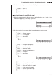
18 - 2 Paired-Variable Statistical Calculation Examples 6(g) 1 2 3 4 5 6 1 (Log) ........ Logarithmic regression graph 2 (Exp) ........ Exponential regression graph 3 (Pwr) ........ Power regression graph 6 (g) ........... Previous menu u To select the x-axis data list (XList) 1. While the graph settings screen is on the display, use f and c to move the highlighting to the XList item. 1 2 3 4 5 6 2.
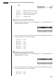
Paired-Variable Statistical Calculation Examples 18 - 2 3 (List3) ....... List 3 4 (List4) ....... List 4 5 (List5) ....... List 5 6 (List6) ....... List 6 u To select the frequency data list (Frequency) 1. While the general graph settings screen is on the display, use f and c to move the highlighting to the Frequency item. 1 2 3 4 5 6 2. Use the function key menu to select the frequency setting you want. 1 (1) ............ Plot all data (1-to-1) 2 (List1) ....... List 1 data is frequency data.
18 - 2 Paired-Variable Statistical Calculation Examples k Drawing an xy Line Graph P.289 (Graph Type) Paired data items can be used to plot a scatter diagram. A scatter diagram where the points are linked is an xy line graph. ( xy) Press J or !Q to return to the statistical data list. k Selecting the Regression Type After you graph statistical data, you can use the function menu at the bottom of the display to select from a variety of different types of regression. 1 2 3 4 5 6 1 (X) ............
Paired-Variable Statistical Calculation Examples 18 - 2 k Displaying Statistical Calculation Results Whenever you perform a regression calculation, the regression formula parameter (such as a and b in the linear regression y = ax + b) calculation results appear on the display. You can use these to obtain statistical calculation results. Regression parameters are calculated as soon as you press a function key to select a regression type while a graph is on the display.
18-3 Calculating and Graphing Single-Variable Statistical Data Single-variable data is data with only a single variable. If you are calculating the average height of the members of a class for example, there is only one variable (height). Single-variable statistics include distribution and sum. The following five types of graphs are available for single-variable statistics.
Calculating and Graphing Single-Variable Statistical Data 18 - 3 From the statistical data list, press 1 (GRPH) to display the graph menu, press 6 (SET), and then change the graph type of the graph you want to use (GPH1, GPH2, GPH3) to mean-box graph. Note : This function is not usually used in the classrooms in U.S. Please use Med-box Graph, instead. k Normal Distribution Curve P.289 (Graph Type) (N•Dis) The normal distribution curve is graphed using the following normal distribution function.
18 - 3 Calculating and Graphing Single-Variable Statistical Data k Displaying Single-Variable Statistical Results Single-variable statistics can be expressed as both graphs and parameter values. When these graphs are displayed, the menu at the bottom of the screen appears as below. 1 (1VAR) ..... Single-variable calculation result menu Pressing 1 (1VAR) displays the following screen. 1(1VAR) • Use c to scroll the list so you can view the items that run off the bottom of the screen.
18-4 Calculating and Graphing Paired-Variable Statistical Data Under “Plotting a Scatter Diagram,” we displayed a scatter diagram and then performed a logarithmic regression calculation. Let’s use the same procedure to look at the six regression functions. k Linear Regression Graph P.289 Linear regression plots a straight line that passes close to as many data points as possible, and returns values for the slope and y-intercept (y-coordinate when x = 0) of the line.
18 - 4 Calculating and Graphing Paired-Variable Statistical Data 6(DRAW) The following are the meanings of the above parameters. a ...... Med-Med graph slope b ...... Med-Med graph intercept k Quadratic/Cubic/Quartic Regression Graph P.289 A quadratic/cubic/quartic regression graph represents connection of the data points of a scatter diagram. It actually is a scattering of so many points that are close enough together to be connected.
Calculating and Graphing Paired-Variable Statistical Data 18 - 4 Quartic regression a ...... b ...... c ...... d ...... e ...... Quartic regression coefficient Cubic regression coefficient Quadratic regression coefficient Linear regression coefficient Regression constant term (intercept) k Logarithmic Regression Graph P.290 Logarithmic regression expresses y as a logarithmic function of x.
- 4 Calculating and Graphing Paired-Variable Statistical Data 6(DRAW) The following are the meanings of the above parameters. a ...... Regression coefficient b ...... Regression constant term r ...... Correlation coefficient k Power Regression Graph P.290 Exponential regression expresses y as a proportion of the power of x. The standard power regression formula is y = a × xb, so if we take the logarithms of both sides we get logy = loga + b × logx.
Calculating and Graphing Paired-Variable Statistical Data 18 - 4 k Displaying Paired-Variable Statistical Results P.290 Paired-variable statistics can be expressed as both graphs and parameter values. When these graphs are displayed, the menu at the bottom of the screen appears as below. 1 2 3 4 5 6 4(2VAR) ...... Paired-variable calculation result menu Pressing 4 (2VAR) displays the following screen. 4(2VAR) • Use c to scroll the list so you can view the items that run off the bottom of the screen.
18 - 4 Calculating and Graphing Paired-Variable Statistical Data k Copying a Regression Graph Formula to the Graph Mode After you perform a regression calculation, you can copy its formula to the GRAPH Mode. The following are the functions that are available in the function menu at the bottom of the display while regression calculation results are on the screen. 1 2 3 4 5 6 5 (COPY) .... Stores the displayed regression formula to the GRAPH Mode 6 (DRAW).... Graphs the displayed regression formula 1.
Calculating and Graphing Paired-Variable Statistical Data 18 - 4 6(DRAW) P.289 1(X) • The text at the top of the screen indicates the currently selected graph (StatGraph1 = Graph 1, StatGraph2 = Graph 2, StatGraph3 = Graph 3). 1. Use f and c to change the currently selected graph. The graph name at the top of the screen changes when you do. c 2. When graph you want to use is selected, press w. P.296 P.
18-5 Other Graphing Functions k Manual Graphing In all of the graphing examples up to this point, values were calculated in accordance with View Window settings and graphing was performed automatically. This automatic graphing is performed when the Stat Wind item of the View Window is set to “Auto” (auto graphing). You can also produce graphs manually, when the automatic graphing capabilities of this calculator cannot produce the results you want.
18-6 Performing Statistical Calculations All of the statistical calculations up to this point were performed after displaying a graph. The following procedures can be used to perform statistical calculations alone. u To specify statistical calculation data lists You have to input the statistical data for the calculation you want to perform and specify where it is located before you start a calculation. While the statistical data is on the display, perform the following procedure.
18 - 6 Performing Statistical Calculations Now you can press f and c to view variable characteristics. P.296 For details on the meanings of these statistical values, see “Displaying Single-Variable Statistical Results”. k Paired-Variable Statistical Calculations In the previous examples from “Linear Regression Graph” to “Power Regression Graph,” statistical calculation results were displayed after the graph was drawn.
Performing Statistical Calculations 18 - 6 Next, you can use the following. 1 (X) ............ Linear regression 2 (Med) ....... Med-Med regression 3 (X^2) ........ Quadratic regression 4 (X^3) ........ Cubic regression 5 (X^4) ........ Quartic regression 6 (g) ........... Next menu 1 (Log) ........ Logarithmic regression 2 (Exp) ........ Exponential regression 3 (Pwr) ........ Power regression 6 (g) ...........
18 - 6 Performing Statistical Calculations 4. Press the keys as follows. ea(value of xi) K5(STAT)2( )w 1 2 3 4 5 6 The estimated value is displayed for xi = 40. baaa(value of yi) 1( )w The estimated value *(Graph Type) 1(GRPH)6(SET)c (Scatter) 1(Scat)c (XList) 1(List1)c (YList) 2(List2)c (Frequency) (Mark Type) (Auto) (Pwr) is displayed for yi = 1000.
Performing Statistical Calculations 18 - 6 • Probability P(t), Q(t), and R(t), and normalized variate t(x) are calculated using the following formulas. P(t) Example Q(t) R(t) The following table shows the results of measurements of the height of 20 college students. Determine what percentage of the students fall in the range 160.5 cm to 175.5 cm. Also, in what percentile does the 175.5 cm tall student fall? Class no. Height (cm) Frequency 1 158.5 1 2 160.5 1 3 163.3 2 4 167.5 2 5 170.2 3 6 173.
18 - 6 Performing Statistical Calculations 2. Use the STAT Mode to perform the single-variable statistical calculations. 2(CALC)6(SET) c3(List2)J1(1VAR) 3. Press m to display the Main Menu, and then enter the RUN Mode. 4. In the RUN Mode, display the probability calculation menu. • You obtain the normalized variate immediately after performing single-variable statistical calculations only. K6(g)3(PROB)6(g) 1 2 3 4 5 6 4( t() bga.f)w (Normalized variate t for 160.5cm) Result: –1.633855948 ( –1.
Performing Statistical Calculations 18 - 6 k Probability Graphing You can graph a probability distribution with Graph Y = in the Sketch Mode. Example To graph probability P(0.5) Perform the following operation in the RUN Mode. !4(Sketch)1(Cls)w 5(GRPH)1(Y=)K6(g)3(PROB) 6(g)1(P()a.f)w The following shows the View Window settings for the graph. Ymin ~ Ymax –0.1 0.45 Xmin ~ Xmax –3.2 3.