
User's Guide
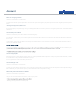


Electricity overview
From the main dashboard you can view your predicted
expenditure, as well as your daily cost and average.
You will also get information on how you are performing
in comparison to your usage the previous month.
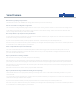
Comparison
Here you can see what your actual and predicted usage is, using the same
two.
The same date formats can be selected from, meaning you can choose
between more immediate targets as well as more long term aims.
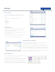
Electricity
As well as your cost prediction for the month;
the color of this $ sign shows how your
predicted cost for this month compares with
the cost of last month. If it is green, you are
predicted to spend less this month. If it is red,
you are predicted to spend more. If it’s amber
you are predicted to spend about the same as
last month.
Your power usage so far today, as well as the
daily average use
Real time cost prediction.
Cumulative
This graph shows your electricity cost so far this month (in orange) and the predicted
cost for the rest of the month (in grey).
You can choose to set your graph for today, yesterday, the previous week, month or
even year. You may also choose custom dates. These predictions are based upon your
previous usage.
amount that you pay for your electricity. This can be found on your paper or online bill,
or by contacting your supplier.