
Users Guide
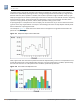
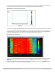
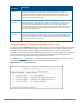
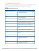
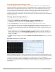
Table Of Contents
- Contents
- About this Guide
- The Basic User-Centric Networks
- Understanding Basic Deployment and Configuration Tasks
- Configuring the Controller
- W-7000 Series and W-7200 Series Controller
- Using the LCD Screen
- Configuring a VLAN to Connect to the Network
- Creating, Updating, and Viewing VLANs and Associated IDs
- Creating, Updating, and Deleting VLAN Pools
- Assigning and Configuring the Trunk Port
- Configuring the Default Gateway
- Configuring the Loopback IP Address for the Controller
- Configuring the System Clock
- Installing Licenses
- Connecting the Controller to the Network
- Enabling Wireless Connectivity
- Enabling Wireless Connectivity
- Configuring Your User-Centric Network
- Replacing a Controller
- Transferring Licenses
- Procedure Overview
- Change the VRRP Priorities for a Redundant Master Pair
- Back Up the Flash File System
- Stage the New Controller
- Add Licenses to the New Controller
- Backup Newly Installed Licenses
- Import and Restore Flash Backup
- Restore Licenses
- Reboot the Controller
- Modify the Host Name
- Modify Topology Settings
- Save your Configuration
- Remove the Existing Controller
- Control Plane Security
- Control Plane Security Overview
- Configuring Control Plane Security
- Managing AP Whitelists
- Managing Whitelists on Master and Local Controllers
- Working in Environments with Multiple Master Controllers
- Replacing a Controller on a Multi-Controller Network
- Configuring Control Plane Security after Upgrading
- Troubleshooting Control Plane Security
- Software Licenses
- Understanding License Terminology
- Working with Licenses
- Centralized Licensing in a Multi-Controller Network
- Using Licenses
- Understanding License Interaction
- License Installation Best Practices and Exceptions
- Installing a License
- Deleting a License
- Moving Licenses
- Resetting the Controller
- Network Configuration Parameters
- Configuring VLANs
- Configuring Ports
- Understanding VLAN Assignments
- VLAN Derivation Priorities for VLAN types
- How a VLAN Obtains an IP Address
- Assigning a Static Address to a VLAN
- Configuring a VLAN to Receive a Dynamic Address
- Configuring Multiple Wired Uplink Interfaces (Active-Standby)
- Enabling the DHCP Client
- Enabling the PPPoE Client
- Default Gateway from DHCP/PPPoE
- Configuring DNS/WINS Server from DHPC/PPPoE
- Configuring Source NAT to Dynamic VLAN Address
- Configuring Source NAT for VLAN Interfaces
- Inter-VLAN Routing
- Configuring Static Routes
- Configuring the Loopback IP Address
- Configuring the Controller IP Address
- Configuring GRE Tunnels
- Configuring GRE Tunnel Groups
- Jumbo Frame Support
- IPv6 Support
- Understanding IPv6 Notation
- Understanding IPv6 Topology
- Enabling IPv6
- Enabling IPv6 Support for Controller and APs
- Filtering an IPv6 Extension Header (EH)
- Configuring a Captive Portal over IPv6
- Working with IPv6 Router Advertisements (RAs)
- RADIUS Over IPv6
- TACACS Over IPv6
- DHCPv6 Server
- Understanding ArubaOS Supported Network Configuration for IPv6 Clients
- Understanding ArubaOS Authentication and Firewall Features that Support IPv6
- Managing IPv6 User Addresses
- Understanding IPv6 Exceptions and Best Practices
- Link Aggregation Control Protocol
- OSPFv2
- Tunneled Nodes
- Authentication Servers
- Understanding Authentication Server Best Practices and Exceptions
- Understanding Servers and Server Groups
- Configuring Authentication Servers
- Configuring a RADIUS Server
- RADIUS Service-Type Attribute
- Enabling Radsec on RADIUS Servers
- Configuring Username and Password for CPPM Authentication
- Configuring an RFC-3576 RADIUS Server
- Configuring an RFC-3576 RADIUS Server with Radsec
- Configuring an LDAP Server
- Configuring a TACACS+ Server
- Configuring a Windows Server
- Managing the Internal Database
- Configuring Server Groups
- Assigning Server Groups
- Configuring Authentication Timers
- Authentication Server Load Balancing
- MAC-based Authentication
- Branch Controller Config for Controllers
- Branch Deployment Features
- WAN Failure (Authentication) Survivability
- Supported Client and Authentication Types
- Administrative Functions
- Enabling Authentication Survivability on a Local Branch Controller
- Configuring the Survival Server Certificate
- Configuring the Lifetime of the Authentication Survivability Cache
- User Credential and Key Reply Attributes Are Saved Automatically
- Expired User Credential and Key Reply Attributes Are Purged Automatically
- About the Survival Server
- Trigger Conditions for Critical Actions
- Authentication for Captive Portal Clients
- Authentication for 802.1X Clients
- Authentication for MAC Address-Based Clients
- Authentication for WISPr Clients
- WAN Health Check
- WAN Optimization through IP Payload Compression
- Interface Bandwidth Contracts
- Integration with a Palo Alto Networks (PAN) Portal
- Branch Controller Routing Features
- Zero-Touch Provisioning
- Using Smart Config to create a Branch Config Group
- PortFast and BPDU Guard
- Preventing WAN Link Failure on Virtual APs
- Branch WAN Dashboard Changes
- 802.1X Authentication
- Understanding 802.1X Authentication
- Configuring 802.1X Authentication
- Enabling 802.1x Supplicant Support on an AP
- Sample Configurations
- Configuring Authentication with an 802.1X RADIUS Server
- Configuring Roles and Policies
- Configuring the RADIUS Authentication Server
- Configuring 802.1X Authentication
- Configuring VLANs
- Configuring the WLANs
- Configuring the Guest WLAN
- Configuring the Non-Guest WLANs
- Configuring Authentication with the Controller’s Internal Database
- Configuring the Internal Database
- Configuring 802.1x Authentication
- Configuring VLANs
- Configuring WLANs
- Configuring the Guest WLAN
- Configuring the Non-Guest WLANs
- Configuring Mixed Authentication Modes
- Performing Advanced Configuration Options for 802.1X
- Application Single Sign-On Using L2 Authentication
- Stateful and WISPr Authentication
- Certificate Revocation
- Captive Portal Authentication
- Understanding Captive Portal
- Configuring Captive Portal in the Base Operating System
- Using Captive Portal with a PEFNG License
- Sample Authentication with Captive Portal
- Configuring Guest VLANs
- Configuring Captive Portal Authentication Profiles
- Enabling Optional Captive Portal Configurations
- Personalizing the Captive Portal Page
- Creating and Installing an Internal Captive Portal
- Creating Walled Garden Access
- Enabling Captive Portal Enhancements
- Configuring the Redirect-URL
- Configuring the Login URL
- Defining Netdestination Descriptions
- Configuring a Whitelist
- Configuring the Netdestination for a Whitelist:
- Associating a Whitelist to Captive Portal Profile
- Applying a Captive Portal Profile to a User-Role
- Verifying a Whitelist Configuration
- Verifying a Captive Portal Profile Linked to a Whitelist
- Verifying Dynamic ACLs for a Whitelist
- Verifying DNS Resolved IP Addresses for Whitelisted URLs
- Bypassing Captive Portal Landing Page
- Virtual Private Networks
- Planning a VPN Configuration
- Working with VPN Authentication Profiles
- Configuring a Basic VPN for L2TP/IPsec in the WebUI
- Configuring a VPN for L2TP/IPsec with IKEv2 in the WebUI
- Configuring a VPN for Smart Card Clients
- Configuring a VPN for Clients with User Passwords
- Configuring Remote Access VPNs for XAuth
- Working with Remote Access VPNs for PPTP
- Working with Site-to-Site VPNs
- Working with VPN Dialer
- Roles and Policies
- Configuring Firewall Policies
- User Roles
- Assigning User Roles
- Understanding Global Firewall Parameters
- Using AppRF 2.0
- ClearPass Policy Manager Integration
- Virtual APs
- Virtual AP Configuration Workflow
- Virtual AP Profiles
- Changing a Virtual AP Forwarding Mode
- Radio Resource Management (802.11k)
- BSS Transition Management (802.11v)
- Fast BSS Transition ( 802.11r)
- SSID Profiles
- WLAN Authentication
- High-Throughput Virtual APs
- Guest WLANs
- Changing a Virtual AP Forwarding Mode
- Adaptive Radio Management
- ARM Feature Overviews
- Configuring ARM Settings
- ARM Troubleshooting
- Understanding ARM
- Client Match
- ARM Coverage and Interference Metrics
- Configuring ARM Profiles
- Assigning an ARM Profile to an AP Group
- Using Multi-Band ARM for 802.11a/802.11g Traffic
- Band Steering
- Enabling Traffic Shaping
- Spectrum Load Balancing
- Reusing Channels to Control RX Sensitivity Tuning
- Configuring Non-802.11 Noise Interference Immunity
- Troubleshooting ARM
- Wireless Intrusion Prevention
- Working with the Reusable Wizard
- Monitoring the Dashboard
- Detecting Rogue APs
- Working with Intrusion Detection
- Understanding Infrastructure Intrusion Detection
- Detecting an 802.11n 40MHz Intolerance Setting
- Detecting Active 802.11n Greenfield Mode
- Detecting Ad hoc Networks
- Detecting an Ad hoc Network Using a Valid SSID
- Detecting an AP Flood Attack
- Detecting AP Impersonation
- Detecting AP Spoofing
- Detecting Bad WEP Initialization
- Detecting a Beacon Frame Spoofing Attack
- Detecting a Client Flood Attack
- Detecting a CTS Rate Anomaly
- Detecting an RTS Rate Anomaly
- Detecting Devices with an Invalid MAC OUI
- Detecting an Invalid Address Combination
- Detecting an Overflow EAPOL Key
- Detecting Overflow IE Tags
- Detecting a Malformed Frame-Assoc Request
- Detecting Malformed Frame-Auth
- Detecting a Malformed Frame-HT IE
- Detecting a Malformed Frame-Large Duration
- Detecting a Misconfigured AP
- Detecting a Windows Bridge
- Detecting a Wireless Bridge
- Detecting Broadcast Deauthentication
- Detecting Broadcast Disassociation
- Detecting Netstumbler
- Detecting Valid SSID Misuse
- Detecting Wellenreiter
- Understanding Client Intrusion Detection
- Detecting a Block ACK DoS
- Detecting a ChopChop Attack
- Detecting a Disconnect Station Attack
- Detecting an EAP Rate Anomaly
- Detecting a FATA-Jack Attack Structure
- Detecting a Hotspotter Attack
- Detecting a Meiners Power Save DoS Attack
- Detecting an Omerta Attack
- Detecting Rate Anomalies
- Detecting a TKIP Replay Attack
- Detecting Unencrypted Valid Clients
- Detecting a Valid Client Misassociation
- Detecting an AirJack Attack
- Detecting ASLEAP
- Detecting a Null Probe Response
- Understanding Infrastructure Intrusion Detection
- Configuring Intrusion Protection
- Understanding Infrastructure Intrusion Protection
- Protecting 40MHz 802.11 High Throughput Devices
- Protecting 802.11n High Throughput Devices
- Protecting Against Adhoc Networks
- Protecting Against AP Impersonation
- Protecting Against Misconfigured APs
- Protecting Against Wireless Hosted Networks
- Protecting SSIDs
- Protecting Against Rogue Containment
- Protecting Against Suspected Rogue Containment
- Protection against Wired Rogue APs
- Understanding Client Intrusion Protection
- Warning Message for Containment Features
- Understanding Infrastructure Intrusion Protection
- Configuring the WLAN Management System (WMS)
- Understanding Client Blacklisting
- Working with WIP Advanced Features
- Configuring TotalWatch
- Administering TotalWatch
- Tarpit Shielding Overview
- Configuring Tarpit Shielding
- Access Points
- Basic Functions and Features
- Naming and Grouping APs
- Understanding AP Configuration Profiles
- Before you Deploy an AP
- Enable Controller Discovery
- Enable DHCP to Provide APs with IP Addresses
- AP Provisioning Profiles
- Configuring Installed APs
- Optional AP Configuration Settings
- RF Management
- Optimizing APs Over Low-Speed Links
- AP Scanning Optimization
- Channel Group Scanning
- Configuring AP Channel Assignments
- Managing AP Console Settings
- Link Aggregation Support on W-AP220 Series and W-AP270 Series
- Service Tag
- Secure Enterprise Mesh
- Mesh Overview Information
- Mesh Configuration Procedures
- Understanding Mesh Access Points
- Understanding Mesh Links
- Understanding Mesh Profiles
- Understanding Remote Mesh Portals (RMPs)
- Understanding the AP Boot Sequence
- Mesh Deployment Solutions
- Mesh Deployment Planning
- Configuring Mesh Cluster Profiles
- Creating and Editing Mesh Radio Profiles
- Creating and Editing Mesh High-Throughput SSID Profiles
- Configuring Ethernet Ports for Mesh
- Provisioning Mesh Nodes
- Verifying Your Mesh Network
- Configuring Remote Mesh Portals (RMPs)
- Creating a Remote Mesh Portal In the WebUI
- Step 1: Provision the AP
- Step 2: Define the Mesh Private VLAN in the Mesh Radio Profile
- Step 3: Assign the Mesh Radio Profile to a Remote Mesh AP
- Step 4: Assign an RF Management Profile to a Remote Mesh AP
- Step 5: Assign a Mesh Cluster Profile
- Step 6: Configuring a DHCP Pool
- Step 7: Configuring the VLAN ID of the Virtual AP Profile
- Provisioning a Remote Mesh Portal In the CLI
- Creating a Remote Mesh Portal In the WebUI
- Increasing Network Uptime Through Redundancy and VRRP
- High Availability
- VRRP-Based Redundancy
- High Availability Deployment Models
- Client State Synchronization
- High Availability Inter-Controller Heartbeats
- High Availability Extended Controller Capacity
- Configuring High Availability
- Migrating from VRRP or Backup-LMS Redundancy
- Configuring VRRP Redundancy
- RSTP
- PVST+
- Link Layer Discovery Protocol
- IP Mobility
- External Firewall Configuration
- Palo Alto Networks Firewall Integration
- Remote Access Points
- About Remote Access Points
- Configuring the Secure Remote Access Point Service
- Deploying a Branch/Home Office Solution
- Enabling Remote AP Advanced Configuration Options
- Understanding Remote AP Modes of Operation
- Working in Fallback Mode
- Configuring Fallback Mode
- Configuring the DHCP Server on the Remote AP
- Configuring Advanced Backup Options
- Specifying the DNS Controller Setting
- Backup Controller List
- Configuring Remote AP Failback
- Enabling RAP Local Network Access
- Configuring Remote AP Authorization Profiles
- Working with Access Control Lists and Firewall Policies
- Understanding Split Tunneling
- Understanding Bridge
- Provisioning Wi-Fi Multimedia
- Reserving Uplink Bandwidth
- Provisioning 4G USB Modems on Remote Access Points
- Provisioning RAPs at Home
- Configuring W-IAP3WN and W-IAP3WNP Access Points
- Converting an IAP to RAP or CAP
- Enabling Bandwidth Contract Support for RAPs
- Virtual Intranet Access
- Spectrum Analysis
- Understanding Spectrum Analysis
- Creating Spectrum Monitors and Hybrid APs
- Connecting Spectrum Devices to the Spectrum Analysis Client
- Configuring the Spectrum Analysis Dashboards
- Customizing Spectrum Analysis Graphs
- Working with Non-Wi-Fi Interferers
- Understanding the Spectrum Analysis Session Log
- Viewing Spectrum Analysis Data
- Recording Spectrum Analysis Data
- Troubleshooting Spectrum Analysis
- Verifying Spectrum Monitors Support for One Client per Radio
- Converting a Spectrum Monitor Back to an AP or Air Monitor
- Troubleshooting Browser Issues
- Loading a Spectrum View
- Troubleshooting Issues with Adobe Flash Player 10.1 or Later
- Understanding Spectrum Analysis Syslog Messages
- Playing a Recording in the RFPlayback Tool
- Dashboard Monitoring
- Management Access
- Configuring Certificate Authentication for WebUI Access
- Secure Shell (SSH)
- Enabling Public Key Authentication
- Enabling RADIUS Server Authentication
- Configuring RADIUS Server Username and Password Authentication
- Configuring RADIUS Server Authentication with VSA
- Configuring RADIUS Server Authentication with Server Derivation Rule
- Configuring a set-value server-derivation rule
- Disabling Authentication of Local Management User Accounts
- Verifying the configuration
- Resetting the Admin or Enable Password
- Bypassing the Enable Password Prompt
- Setting an Administrator Session Timeout
- Connecting to an W-AirWave Server
- Custom Certificate Support for RAP
- Implementing a Specific Management Password Policy
- Configuring AP Image Preload
- Configuring Centralized Image Upgrades
- Managing Certificates
- Configuring SNMP
- Enabling Capacity Alerts
- Configuring Logging
- Enabling Guest Provisioning
- Managing Files on the Controller
- Setting the System Clock
- ClearPass Profiling with IF-MAP
- Whitelist Synchronization
- Downloadable Regulatory Table
- 802.11u Hotspots
- Hotspot 2.0 Pre-Deployment Information
- Hotspot Profile Configuration Tasks
- Hotspot 2.0 Overview
- Configuring Hotspot 2.0 Profiles
- Configuring Hotspot Advertisement Profiles
- Configuring ANQP Venue Name Profiles
- Configuring ANQP Network Authentication Profiles
- Configuring ANQP Domain Name Profiles
- Configuring ANQP IP Address Availability Profiles
- Configuring ANQP NAI Realm Profiles
- Configuring ANQP Roaming Consortium Profiles
- Configuring ANQP 3GPP Cellular Network Profiles
- Configuring H2QP Connection Capability Profiles
- Configuring H2QP Operator Friendly Name Profiles
- Configuring H2QP Operating Class Indication Profiles
- Configuring H2QP WAN Metrics Profiles
- Adding Local Controllers
- Advanced Security
- Securing Client Traffic
- Securing Controller-to-Controller Communication
- Configuring the Odyssey Client on Client Machines
- Voice and Video
- Voice and Video License Requirements
- Configuring Voice and Video
- Working with QoS for Voice and Video
- Unified Communication and Collaboration
- Understanding Extended Voice and Video Features
- Understanding QoS for Microsoft Lync and Apple Facetime
- Enabling WPA Fast Handover
- Enabling Mobile IP Home Agent Assignment
- Scanning for VoIP-Aware ARM
- Disabling Voice-Aware 802.1x
- Configuring SIP Authentication Tracking
- Enabling Real Time Call Quality Analysis
- Enabling SIP Session Timer
- Enabling Wi-Fi Edge Detection and Handover for Voice Clients
- Working with Dial Plan for SIP Calls
- Enabling Enhanced 911 Support
- Working with Voice over Remote Access Point
- Understanding Battery Boost
- Enabling LLDP
- Advanced Voice Troubleshooting
- AirGroup
- Zero Configuration Networking
- AirGroup Solution
- AirGroup Deployment Models
- Features Supported in AirGroup
- ClearPass Policy Manager and ClearPass Guest Features
- Auto-association and Controller-based Policy
- Best Practices and Limitations
- Integrated Deployment Model
- Master-Local Controller Synchronization
- Configuring an AirGroup Integrated Deployment Model
- Enabling or Disabling AirGroup Global Setting
- Enabling or Disabling mDNS and DLNA
- Viewing AirGroup Global Setting on Controller
- Defining an AirGroup Service
- Enabling the allowall Service
- Enabling or Disabling an AirGroup Service
- Viewing AirGroup Service Status
- Viewing Blocked Services
- Viewing AirGroup Service Details
- Configuring an AirGroup Domain
- Viewing an AirGroup Domain
- Configuring an AirGroup active-domain
- Viewing an AirGroup active-domains
- Viewing AirGroup VLAN Table
- Viewing AirGroup Multi-Controller Table
- Controller Dashboard Monitoring
- Configuring the AirGroup-CPPM Interface
- Bluetooth-Based Discovery and AirGroup
- AirGroup mDNS Static Records
- mDNS AP VLAN Aggregation
- mDNS Multicast Response Propagation
- Troubleshooting and Log Messages
- Instant AP VPN Support
- W-600 Series Controllers
- External Services Interface
- Sample ESI Topology
- Understanding the ESI Syslog Parser
- Configuring ESI
- Sample Route-Mode ESI Topology
- ESI server configuration on controller
- IP routing configuration on Fortinet gateway
- Configuring the Example Routed ESI Topology
- Health-Check Method, Groups, and Servers
- Defining the Ping Health-Check Method
- Defining the ESI Server
- Defining the ESI Server Group
- Redirection Policies and User Role
- Syslog Parser Domain and Rules
- Sample NAT-mode ESI Topology
- Understanding Basic Regular Expression (BRE) Syntax
- External User Management
- Behavior and Defaults
- DHCP with Vendor-Specific Options
- 802.1X Configuration for IAS and Windows Clients
- Acronyms and Terms

813 | Spectrum Analysis Dell Networking W-Series ArubaOS 6.4.x| User Guide
This chart is not available for W-AP68 access points. A hybrid AP on a 20 MHz channel will see 40 MHz Wi-Fi data as
non-Wi-Fi data.
The power or duty cycle values recorded in each sweep are mapped to a range of colors. In the average or
maximum FFT power Swept Spectrogram charts, the signal strength levels are indicated by a range of colors
between dark blue, which represents -90 dBm, and red, which represents a higher -50 dBm. The duty cycle
Swept Spectrogram chart shows the percentage of the time tick interval that the selected channel or frequency
was broadcasting a signal. These percentages are indicated by a range of colors between dark blue, which
represents a duty cycle of 0% percent, and red, which represents a duty cycle of 100%.
A spectrogram plot is a complex chart that can display a lot of information. If you are not familiar with these
types of charts, they may be difficult to interpret. The following illustrations can help explain how FFT power
data is rendered in a spectrogram format.
The example in Figure 131 shows how an FFT Power chart could appear if a single data measurement was
plotted as a simple line graph.
Figure 131 Simple Line Graph of FFT Power Data
Now, suppose that each channel’s FFT power level was also represented by a color that corresponded to that
specific FFT power level. In the example below, channel 12 has a FFT power level of -50 dBm, represented by
the color red. Channel 1 has a FFT power level of -85 dBm, represented by dark blue.
Figure 132 FFT Power Line Graph with Color