
User guide


3. Usage Comparison
The Usage Comparison screens graphically display your consumpon for each fuel . These update
throughout the day and can be looked at to easily review your daily usage.
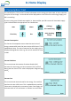
Your Average
This screen shows the amount consumed today against your
daily average use for the last 14 days.
The value above ‘Todays use’ shows the total number of units
used today since midnight.
Your 14 day average is shown at the top under ‘Your Average’
e.g. 20 kWh.
The arrow on the gauge will move round with each unit consumed. When the arrow reaches the
middle this indicates that your usage has equalled your 14 day average. When the arrow moves past
the centre towards ‘High’ this indicates that your usage today is higher than your 14 day average.
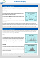
4. Historic Comparison
The Historic Comparison screens contain graphs displaying your consumpon for Today, Yesterday,
Last 7 days and the last 12 months*. In each case the screens will show the supply type with the
appropriate period in the tle e.g. ‘Heat Today’
Today
This graph shows a full 24 hour period from 00:00 to 23:59 for
the present day. Each bar shows the amount of consumpon
during any given hour. At the beginning of the day this graph
will be empty and is updated hourly. The number of units is
shown on the vercal scale along with the unit of measure.
Yesterday
This screen shows the full 24 hour period for the previous day.
Each bar shows the total consumpon during each hour of that
day. The number of units is shown on the vercal scale along
with the unit of measure..
*Please note if your G6 is replaced or reprogrammed, all historical data
will be reset. If your G6 has power disconnected then the values for ‘Today’ and ‘Yesterday’ screens will be lost.
In-Home Display
Page 11
Page 12