
HP Intelligent Management Center v5.1 SP1 Application Manager Administrator Guide


155
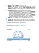
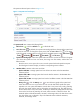
Figure 112 CPU Usage Ratio—Trend graph area layout
The CPU Usage Ratio area contains the following fields:
• Refresh icon —Click the Refresh icon to refresh the area.
• Dashboard icon /Trend icon —Click the Dashboard icon or the Trend icon to
view the CPU usage ratio.
Dashboard icon —Click the Dashboard icon to view the CPU usage ratio in the last
APM polling period.
Trend icon —Click the Trend icon to view the changes of the CPU usage ratio for the
Linux application in a line chart. Place the cursor over a spot in the curve to view the CPU
usage ratio at the specific time point. Operators can view the changes of the CPU usage ratio
over a specified time period by clicking the Last 1 hour icon , Last 6 hours icon ,
Today icon , Yesterday icon , This Week icon , This Month icon , and This Year
icon . The default time period is last one hour.
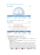
• CPU Usage Ratio—CPU usage ratio of the Linux application in the last APM polling period.
Set Threshold icon —Click the Set Threshold icon to set alarm thresholds for the CPU
usage ratio. The specified alarm thresholds appear on the CPU Usage Ratio trend graph as
dotted lines. The data is highlighted in yellow when the CPU usage ratio reaches the level-1
threshold, and is highlighted in red when the CPU usage ratio reaches the level-2 threshold.
You can either use the global thresholds or self-defined thresholds.
History icon —Click the History icon to view the history graph of the CPU usage ratio
trend. Place the cursor over a spot in the curve to view the CPU usage ratio at the specific time
point. Operators can view CPU usage ratio statistics over the last 1 hour, last 6 hours, today,
yesterday, this week, this month, and this year by clicking the corresponding icons on the
upper right of the graph. The data shown in the line charts of last 1 hour, last 6 hours, and
today is collected in polling intervals. The data shown in the line charts of yesterday, this
week, and this month is collected in hours. The statistical results include the maximum,
minimum, and average values. The data shown in the line chart of this year is collected in
days. The statistical results include the maximum, minimum, and average values.
Memory Usage Ratio
The Memory Usage Ratio pane is shown in Figure 113 and Figure 114.