
HP Intelligent Management Center v5.1 SP1 Application Manager Administrator Guide

175
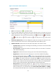
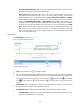
time period Yesterday, This week, or This month, the connection time of the SQL Server
is measured in hours, and the diagram displays the connection time trend, and the maximum,
minimize, and average connection time of the SQL Server; if you select the time period This
year, the connection time of the SQL Server is measured in days, and the diagram displays
the connection time trend, and the maximum, minimize, and average connection time of the
SQL Server. Move the pointer over the each sampling point to view the connection time of the
SQL Server for the time being.
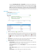
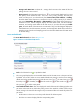
Buffer details
The Buffer Details are shown as Figure 128.
Figure 128 Buffer details -SQL Server
• Fresh—Click the Fresh icon to update the detail.
• The curve graph displays the cache hit ratio trend of the SQL Server in the past one hour by
default. You can also select a time period to view the cache hit ratio trend in the specified time
period. Click the Last 1 hour icon , the Last 6 hours icon , the Today icon , the Yesterday
icon , the This week icon , the This month icon , or the This year icon to select a time
period.
• Buffer Detail—This chart displays the variation of the SQL Server Buffer Hit ratio in the last hour.
Put the mouse on the curve to view the specific data of all collection points.
• Attribute and Value—Indicate the name and data of the indexes. The index includes:
Cache Hit Ratio—Specify the ratio of cache hit time and searching time when APM did the
last polling. The higher ratio stands for, the better performance is.
Cache Objects in use—Specify the Cache Objects in use per minute when APM did the
last polling.
Cache Object Counts—Specify the counts of the cache object when APM did the last
polling.
Cache Pages—Specify the buffer pages when APM did the last polling.