
HP Intelligent Management Center v5.1 SP1 Application Manager Administrator Guide


44
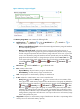
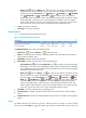
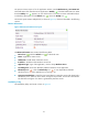
graph as dotted lines in different colors: yellow for the level-1 threshold and red for level-2.
The CPU usage ratio is highlighted in yellow when it reaches the level-1 threshold, and is
highlighted in red when it reaches the level-2 threshold. You can use either the global
thresholds or user-defined thresholds. For information about configuring alarm thresholds, see
"xxx."
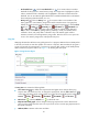
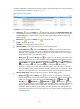
History icon —Click the History icon to view statistics of the history CPU usage trend
for Windows XP in a line graph. By default, the graph shows the last hour statistics. To change
the report period, click the Last 6 Hours icon , Today icon , Yesterday icon , This
Week icon , This Month icon , or This Year icon on the upper right of the graph
as needed. Hourly data and today's data is collected every polling interval, yesterday's,
weekly, and monthly data is collected in hours, and yearly data is collected in days. The
statistics graph contains maximum, minimum, and average CPU usage ratios. Place the cursor
over a spot in the curve to view CPU usage ratios at the specific time point.
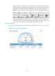
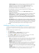
Memory Usage Ratio
You can view the memory usage in a dashboard or a trend graph, as shown in Figure 15 and Figure
16.
Figure 15 Memory usage dashboard graph