
HP Intelligent Management Center v5.2 Application Performance Manager Administrator Guide

57
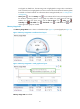
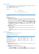
trend graph as dotted lines. The CPU usage ratio is highlighted in orange when it reaches the
level-1 threshold, and is highlighted in red when it reaches the level-2 threshold. Use the global
thresholds or custom thresholds. For information about setting thresholds, see "5 Configuration
management."
History icon —Click the History icon to view statistics of the history CPU usage trend for
the Windows operating system in a line graph. By default, the graph shows the last hour
statistics. To change the report period, click the Last 6 Hours icon , Today icon ,
Yesterday icon , This Week icon , This Month icon , or This Year icon on the
upper right of the graph as needed.
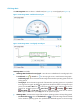
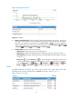
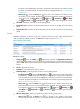
Memory Usage Ratio
The Memory Usage Ratio area is shown in a dashboard (see Figure 15) or trend graph (see Figure 16).
Figure 15 Memory Usage Ratio—Dashboard area layout
Figure 16 Memory Usage Ratio—Trend graph area layout
Memory Usage Ratio area fields: