
HP Intelligent Management Center v5.2 Application Performance Manager Administrator Guide

390
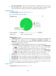
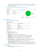
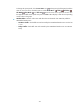
Figure 331 Response time area layout
Response Time area fields:
Response time trend graph—Shows changes of the response time of the SOAP-based Web service
in the last 1 hour in a line chart. Hover the cursor over a spot in the curve to view the service
response time at the specific time point. To change the report period, click the Last 1 Hour icon
on the upper right of the graph, and then select an icon from the list. Available options include Last
6 Hours , Today , Yesterday , This Week , This Month , and This Year .
Attribute/Value—Monitor index name and data.
Response Time—Round trip response time of the SOAP-based Web service in the last polling
period.
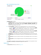
Set Threshold icon —Click the Set Threshold icon to set alarm thresholds for the service
response time. The specified alarm thresholds appear on the response time trend graph as
dotted lines. The data is highlighted in orange when it reaches the level-1 threshold, and is
highlighted in red when it reaches the level-2 threshold. Use the global thresholds or custom
thresholds. For information about setting the thresholds, see "Threshold Management."
History icon —Click the History icon to view the history graph of the response time
trend. By default, the graph shows the last hour statistics. Hover the cursor over a spot on the
curve to view the service response time at the specific time point. Authorized users can view
service response time statistics over the last 1 hour, last 6 hours, today, yesterday, this week, this
month, and this year by clicking the corresponding icons on the upper right of the graph.
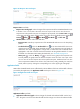
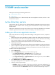
Application Traffic
APM collects the Restful Web service traffic based on the IP address of the host and the traffic collection
port used by the application. The Application Traffic area layout is shown in Figure 332.
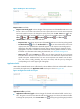
Figure 332 Application Traffic area layout
Application Traffic area fields:
Application Traffic trend graph—Shows changes of inbound and outbound traffic over the last 1
hour. The green curve shows the inbound traffic and the orange curve shows the outbound traffic.