HP Integrated Archive Platform Performance Graphs and Counters Table of Contents Introduction ......................................................................................................................................... 2 Platform Store and Indexing Performance Graphs and Counters ................................................................ 3 System Monitoring Performance Graphs and Counters .............................................................................
Introduction The objective of this whitepaper is to provide clarification of the Integrated Archive Platform (IAP) Performance Graph feature in the Platform Control Center (PCC). The performance graphs provide administrators with a graphical real time and historical view of IAP performance. Performance of the IAP can be monitored either at the platform level, or by the individual systems that comprise the IAP.
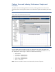
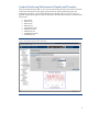
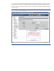
Platform Store and Indexing Performance Graphs and Counters The Platform Store and Indexing performance counters provide a graphical view of the overall performance of the IAP. Using these counters we can observe the ingestion and indexing rates of the IAP. Figure 1.
Using Store Rate, we can get a historical view of archive performance and identify peak demands on the archive system. Understanding when archive rates are at maximum and minimum can help IT departments plan maintenance periods. Scheduling maintenance when ingestion rates are at a minimum can help avoid a backup of email on the messaging system’s journal mailbox(es). We can also use this data for capacity planning of IAP storage requirements.
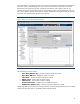
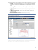
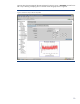
System Monitoring Performance Graphs and Counters Using the System Monitoring Tab, we can view the system level performance and resource utilization of the servers that operate as host groups within the IAP. The system performance graphs are displayed by host group. Use the Select Machine Type drop-down menu as shown in Figure 3 to generate a performance graph for a specific host group.
The following system level counters are collecting performance data from each server in a host group: • • • • • • • Idle CPU – Percentage of time the processor is not active. For example, if the CPU counter averages 70% idle, then we can conclude the CPU was busy processing tasks 30% of the time.
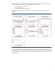
Below are graphs of the system counters collected on the PCC server. By reviewing these graphs we can make the following observations regarding system resource utilization: • • • 70% Idle CPU (30% consumed) 60% Disk Utilization 47% Free Memory (53% consumed) At these system resource utilization rates, we can conclude the PCC is under a light to moderate workload. Figure 5. PCC System Monitoring Performance Counters We can also see that the Java Heap Total memory is 227.
Performance Graph Time Lines and Sample Rates Using the Select Time Frame drop-down menu, an administrator can select a performance graph that ranges from the last 15 Minutes to the Previous Year. Figure 6.
We can also choose Custom Time Range to generate a performance graph for a specific time range by choosing the Year, Month, Day, and Hour for the beginning and end of the monitoring period. Sampling rates of 5 minutes, hourly, daily, monthly, or yearly can be selected for graphical display as shown in Figure 7. Figure 7.
Figure 8 shows the percentage of Idle CPU utilization for the PCC server in 5 minute intervals for the last 7 Days. Selecting a sampling rate of 5 minutes creates the graph shown in Figure 8. Figure 8.
Figure 9 shows the same data as displayed in Figure 8, this time % Idle CPU for the past 7 days is sampled in hourly intervals. This graph in Figure 9 has fewer data points than the graph in Figure 8. Figure 9.
Errors can occur when attempting to display a performance graph over an extended period of time while using a short time interval for the sampling rate. In Figure 10, we have attempted to display the last 14 days of Idle CPU utilization using a high sampling rate of 5 minutes. As you can see, the system was unable to create a graph for this time period using this sampling rate. Figure 10.
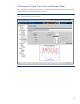
Practical (Operational) Example Looking at the % Free Memory for our SmartCell Servers in Figure 11, we can see SmartCell Server 10.0.172.2 has significantly less available memory when compared with the other three SmartCell servers. While the other three SmartCell servers are running at approximately 32% Free memory, SmartCell server 10.0.172.2 has been running at 10% Free Memory since sometime before the 21st of November. Figure 11. SmartCell (10.0.172.
As you can see by the performance graph in Figure 12, the Free Memory for this system (10.0.172.2) went from 10% Free Memory to approximately 50% Free Memory. Figure 12. SmartCell 10.0.172.
Summary In summary, this document examined the performance graphs and counters available to the IAP. The performance counters are split into two categories: Platform Store and Indexing, and System Monitoring. Platform Store and Indexing provides counters and graphs that monitor the store performance of the IAP. The System Monitoring performance provides counters and graphs to monitor of each individual server’s system performance and resource utilization.
For More Information For more information on the HP Integrated Archive Platform, please visit www.hp.com/go/ILM To learn more about award winning industry hardware, please visit the HP website at www.hp.com Technology for better business outcomes © Copyright 2009 Hewlett-Packard Development Company, L.P. The information contained herein is subject to change without notice.