
HP XP P9000 Performance Advisor Software v6.0 User Guide

For more information on the sections in the Dashboard screen, see “Viewing dashboard” (page 103).
For more information on setting thresholds and specifying the X busiest components, see “Configuring
dashboard threshold settings” (page 97) and “Specifying the top 20 consumers” (page 99).
NOTE: ACP and DKA, CHIP and CHA are terms that are used synonymously across the HP XP
P9000 Performance Advisor screens and in this user guide.
High-level steps for configuring threshold limits and viewing dashboard
The following are the high-level sequence of steps to configure the threshold settings and view the
overall usage summary of the XP and the P9000 disk arrays. The links at the end of each step
direct you to additional information related to that task:
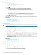
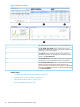
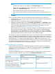
1. On the Threshold Setting screen, enter the threshold limits and select the threshold duration
for the XP and the P9000 disk arrays. Specify the maximum and the least X busiest components
you want to view for a port, RAID group, or an MP blade (applicable only for the P9000 disk
arrays). For more information on specifying threshold limits and component settings, see
“Configuring dashboard threshold settings” (page 97) and “Specifying the top 20 consumers”
(page 99).
Figure 6 Threshold Setting screen
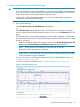
2. Click a status icon in the Frontend, Cache, Backend, or the MP Blade (applicable only for the
P9000 disk arrays) category in the XP/P9000 Array Health section to view the corresponding
average usage summary of individual components in the Statistics section. For more information,
see “XP/P9000 array health” (page 104).
3. Select components and associated metrics in the Statistics section to plot the corresponding
usage graphs in the Chart Work Area. For more information, see “Dashboard statistics”
(page 105).
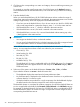
You can select a component and click Show Consumers to view the maximum and least X
busiest components associated with a port, RAID group, or an MP blade. For more information,
see “Specifying the top 20 consumers” (page 99).
4. The Chart Work Area displays the usage pattern of components for the selected metrics and
threshold duration. It also displays the high watermark, which indicates the highest average
usage value of a particular component during the threshold duration. For more information,
see “Dashboard charts” (page 111).
Introduction 95