
Install Instructions

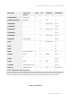

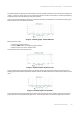
Table Of Contents
- About This Manual
- Important Notice
- Introduction
- Document structure
- Document marks
- Key Features
- Hardware Platform
- Power supply
- Lightning protection unit
- Synchronization unit
- // 0) { /* For each inline-commented element clear data-ref and class */ for (var i=0; i < commentedElements.length; i++) { commentedElements[i].dataset.ref= ""; commentedElements[i].className = ""; } } /* Else do nothing */ } }); //]> AUX-ODU-SYNC Mounting
- AUX-ODU-SYNC Cable gland Assembling
- AUX-ODU-SYNC Connection to ODU
- Packing List
- Planning considerations
- Link Pre-configuration in the lab
- Installation
- Operation & Administration
- Troubleshooting
- Glossary

Infinet Wireless: Technical Documentation – InfiMAN Evolution
Operation & Administration – 80
•
•
•
The system displays, by default, the daily data logs. All charts support simultaneous zoom to improve usability: the
“zoom in” action in a certain region on any of the charts reflects on all other charts that are re-scaled automatically
to display the data collected during the same period of time.
Critical events like link outages or frequency swaps are marked by small red balloons on the bottom of each graph.
Move the mouse over each balloon for details:
40 Figure - Statistics graphs - balloon indicators
Working with the charts:
Select a chart region to zoom in
Hold the «Shift» button and drag the graphs to the pan
Double-click on any chart to reset the zoom.
The parameters that can be monitored are:
41 Figure - Statistics Graphs - RX/TX Ref. Level
This chart displays the measured RX (green) and TX (blue) signal levels. Red regions represent link outages. The
default graph uses the CINR measurement method; however, the RSSI method can be selected from the drop-down
menu.
42 Figure - Statistics Graphs - RX/TX Retries
This chart displays the retry percentage (it provides a quick estimation of the link quality). Similar to the previous
graph, RX retries are represented by the green lines, TX retries by the blue lines and link outages by the red lines.