
Calc Guide

Choosing a chart type
The Chart Wizard includes a sample chart with your data. This sample chart updates
to reflect the changes you make in the Chart Wizard.
The Chart Wizard has three main parts: a list of steps involved in setting up the chart,
a list of chart types, and the options for each chart type. At any time you can go back
to a previous step and change selections.
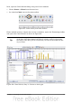
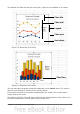
Calc offers a choice of 10 basic chart types, with a few options for each type of chart.
The options vary according to the type of chart you pick.
The first tier of choice is for two-dimensional (2D) charts. Only those types which are
suitable for 3D (Column, Bar, Pie, and Area) give you an option to select a 3D look.
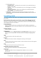
On the Choose a chart type page (Figure 66), select a type by clicking on its icon. The
preview updates every time you select a different type of chart, and provides a good
idea of what the finished chart will look like.
The current selection is highlighted (shown with a surrounding box) on the Choose a
chart type page. The chart’s name is shown just below the icons. For the moment, we
will stick to the Column chart and click on Next again.
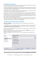
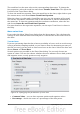
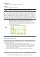
Changing data ranges and axes labels
In Step 2, Data Range, you can manually correct any mistakes you have made in
selecting the data.
On this page you can also change the way you are plotting the data by using the rows
—rather than the columns—as data series. This is useful if you use a style of chart
such as Donut or Pie to display your data.
Lastly, you can choose whether to use the first row or first column, or both, as labels
on the axes of the chart.
You can confirm what you have done so far by clicking the Finish button, or click
Next to change some more details of the chart.
We will click Next to see what we can do to our chart using the other pages of the
Wizard.
Figure 67: Changing data ranges and axes labels
72 OpenOffice.org 3.3 Calc Guide