
Calc Guide

Selecting data series
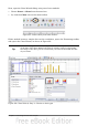
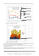
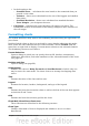
Figure 68: Amending data series and ranges
On the Data Series page, you can fine tune the data that you want to include in the
chart. Perhaps you have decided that you do not want to include the data for canoes.
If so, highlight Canoes in the Data series box and click on Remove. Each named
data series has its ranges and its individual Y-values listed. This is useful if you have
very specific requirements for data in your chart, as you can include or leave out
these ranges.
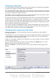
Tip
You can click the Shrink button next to the Range for Name box to
work on the spreadsheet itself. This is handy if your data ranges are
larger than ours and the Chart Wizard is in the way.
Another way to plot any unconnected columns of data is to select the first data series
and then select the next series while holding down the Ctrl key. Or you can type the
columns in the text boxes. The columns must be separated by semi-colons. Thus, to
plot B3:B11 against G3:G11, type the selection range as B3:B11;G3:G11.
The two data series you are selecting must be in separate columns or rows.
Otherwise Calc will assume that you are adding to the same data series.
Click Next to deal with titles, legend and grids.
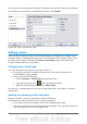
Adding or changing titles, legend, and grids
On the Chart Elements page (Figure 69), you can give your chart a title and, if
desired, a subtitle. Use a title that draws the viewers’ attention to the purpose of the
chart: what you want them to see. For example, a better title for this chart might be
The Performance of Motor and Other Rental Boats.
It may be of benefit to have labels for the x-axis or the y-axis. This is where you give
viewers an idea as to the proportion of your data. For example, if we put Thousands
in the y-axis label of our graph, it changes the scope of the chart entirely. For ease of
estimating data you can also display the x- or y- axis grids by selecting the Display
grids options.
Chapter 3 Creating Charts and Graphs 73