
Calc Guide
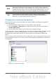
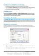
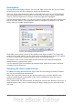
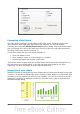
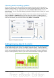
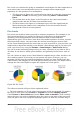

Figure 80: Formatting axis labels
Formating data labels
You can choose properties for the labels of the data series. Carefully click on the
chart element, then right-click and choose the property you want to change.
Choosing the command Format Data Labels opens a dialog with several tabs where
you can change the color of the label text, the size of the font, and other attributes.
The Data Label tab is shown in Figure 72.
On the Data Label tab, you can choose whether to:
• Show the labels as text
• Show numeric values as a percentage or a number
• Include the legend box as part of the label
The text for labels is taken from the column labels and it cannot be changed here. If
the text needs to be abbreviated, or if it did not label your graph as you were
expecting, you need to change it in the original data table.
Hierarchical axis labels
Multiple columns of categories are now displayed in a hierarchical manner at the axis
as shown. To get that automatically while creating a chart, make sure that all the first
columns (or rows) contain text and not only numbers. You can also choose to set the
ranges for categories to multiple columns on the Data Series page in the Wizard or
the Data Ranges dialog.
86 OpenOffice.org 3.3 Calc Guide