
Calc Guide

Bar charts are excellent for giving an immediate visual impact for data comparison in
cases when time is not an important factor, for example when comparing the
popularity of a few products in a marketplace.
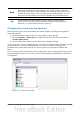
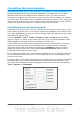
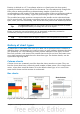
• The first chart in Figure 83 is achieved quite simply by using the chart wizard
with Insert > Grids, deselecting y-axis, and using Insert > Mean Value
Lines.
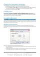
• The second chart in the figure is the 3D option in the chart wizard with a
simple border and the 3D chart area twisted around.
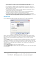
• The third chart in the figure is an attempt to get rid of the legend and put
labels showing the names of the companies on the axis instead. We also
changed the colors to a hatch pattern.
Pie charts
Pie charts are excellent when you need to compare proportions. For example, a pie
chart would be ideal if you needed to figure out comparisons of departmental
spending, what the department spent on different items or what different
departments spent. These charts work best with smaller numbers of values, no more
than about half a dozen. Any more than this and the visual impact starts to fade.
As the Chart Wizard guesses the series that you wish to include in your pie chart, you
might need to adjust this initially on the Wizard’s Data Ranges page if you know you
want a pie chart or by using the Format > Data Ranges > Data Series dialog.
You can do some interesting things with a pie chart, especially if you make it into a
3D chart. It can then be tilted, given shadows, and generally turned into a work of
art.
You can choose an option in the Chart Wizard to explode the pie chart, but this is an
all-or-nothing option. If your aim is to accentuate one piece of the pie, you can
separate out one piece by carefully highlighting it after you have finished with the
Chart Wizard, and dragging it out of the group. When you do this, you might need to
enlarge the chart area again to regain the original size of the pieces.
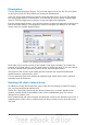
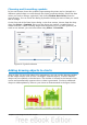
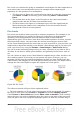
Figure 84: Pie charts
The effects achieved in Figure 84 are explained below.
• The first example is a 2D pie chart with one part of the pie exploded. To produce
this type of chart, first choose Insert > Legend and deselect Display legend.
Choose Insert > Data Labels and choose Show value as number. Then carefully
select the piece you wish to highlight, move the cursor to the edge of the piece and
click (the piece will have nine green highlight squares to mark it), and then drag it
90 OpenOffice.org 3.3 Calc Guide