
Calc Guide
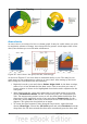
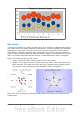

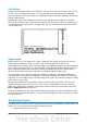

Figure 91: Bubble chart showing three data series
Net charts
A net chart is similar to a polar or radar chart. It is useful for comparing data that is
not a time series but shows different circumstances, such as variables in a scientific
experiment or direction. The poles of the net chart are equivalent to the y-axes of
other charts. Generally, between three and eight axes are best; any more and this
type of chart becomes confusing. Before and after values can be plotted on the same
chart, or perhaps expected and real results, so that differences can be compared.
Figure 92 shows two types of net charts:
• (Left): A plain net chart without grids or lines, only points.
• (Right): A net chart with lines, points and a grid. Axes colors and labels have
been changed. The chart area color has been changed with a gradient effect.
The points on this graph have been changed to fancy 3D spheres.
Figure 92: Two net diagrams showing totally fabricated data from totally fictional
experiments.
Chapter 3 Creating Charts and Graphs 95