
System information

Identity Manager Workflows, Forms, and Views
Part Number 820-2952-10 Page 141
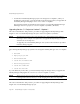
Example
The following example from the Tabbed User Form shows a form field that uses the
ListEditor display class:
This code snippet creates a field where the customer can add groups to or remove them
from a user.
allowTextEntry
(Boolean) A value of
true
indicates that Identity Manager displays a text entry
box, along with an add button.
fixedWidth
(Boolean) A value of
true
indicates that the component should be of fixed width
(same behavior as
Multiselect
component).
ordered
(Boolean) A value of
true
indicates that the order of values is important.
sorted
(Boolean) A value of
true
indicates that the values should be sorted in the pick
list. If values are multi-valued and not ordered, Identity Manager also sorts the
value list.
pickValueMap
(List or Map) Specifies a map of display labels for the values in the pick list.
pickValues
(List) Specifies the available values in the
picklist
component. If null, the
picklist
is not shown
height
(Integer) Specifies preferred height.
width
(Integer) Specifies the preferred width. Can be used by the Container as a
property of the table cell in which this item is rendered
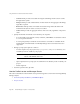
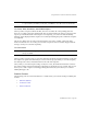
<Field name='accounts[Sim1].Group'>
<Display class='ListEditor' action='true'>
<Property name='listTitle' value='stuff'/>
<Property name='allowTextEntry'>
<Boolean>true</Boolean>
</Property>
<Property name='ordered'>
<Boolean>true</Boolean>
</Property>
</Display>
<Expansion>
<ref>accounts[Sim1].Group</ref>
</Expansion>
</Field>
Table 3 Properties of the ListEditor Component
Property Description