
User Guide

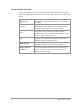
Table Of Contents

How to use this document
Icons and other visual cues are used throughout this document to help the
reader with important information. These icons and visual cues are described
below:
Warning:
Indicates that this information is important and if
disregarded could result in an injury to yourself or
to others.
Caution:
Indicates that this information is important and if
disregarded could result in serious damage to the
product or other devices or a minor injury.
Note:
Contains additional information that could be
exceptions to the general text. They may also
contain references to additional information in this
guide or other reading material.
Tip:
Contains additional information that could help you
perform a task quicker by offering an alternative
method to that in the general text.
Bold typeface
Used to highlight parts of the radio, such as keys
and buttons, key presses and menu options.
Menu > Phone >
Contacts
Indicates navigation through the menu structure to
the desired option based on the default language
strings. Note: your radio may be customised to use
different language strings.
2
SC20 series – 04/2016