
User`s guide


<option value="CA">California</option>
</select>
By default, the Select changes its width to accommodate the selected item. This is rather unusual
(opinion) as the widget seems to move about. We can set a fixed width using the "width" CSS style
property.
Among its more important properties are:
• disabled – A boolean. If set to true, then the control is disabled. If disabled, it has a
disabled appearance.
• options – An array of the options for the select.
• labelAttr – If the select options are provided by a store, this property is used to set the
field within an item in the store to be used as an entry.
Among its more important methods are:
• removeOption() - Removes an option. The parameter can be a string or an ordinal
number. It can also be a list of existing options. This becomes especially useful if we
combine this method with getOptions() which returns a list of all the existing options.
For example.
mySelect.removeOption(mySelect.getOptions());
will remove all the existing options.
See also:
• dijit.form.Select – 1.9
• dijit.form.MultiSelect – 1.9
• Getting Selective with Dijit – 1.9
• Advanced Dijit Selects using Stores – 1.9
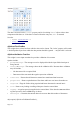
Visual Panes
Visuals panes are visible container of data.
See also:
• dijit/layout/ContentPane
• dijit/TitlePane
• dijit/Fieldset
dijit/TitlePane
The dijit/TitlePane widget shows a panel with a title at the top. The pane can be collapsed.
The pane has a title and content.
The key properties of this widget are:
• title – The title to be shown in the heading of the pane.
• content – A DOM node to be contained within title pane.
• open – A boolean which says whether or not the title pane should be shown initial open or
Page 158