
User`s guide


dojox/mobile/PageIndicator
This widget shows a visual indication of which view from a set of views is currently being shown.
Currently it is linked to the dojox/mobile/SwapView container to show the view in use.
dojox/mobile/Pane
This widget is a simple div-wrapper pane. It contains a property called "containerNode" which
is the DOM node wrapped by this widget.
dojox/mobile/ProgressBar
This widget shows a horizontal progress bar. It has a value that is used to show the progress to a
goal.
Some of the key properties of this widget are:
• value – The current value of the progress.
• maximum – The maximum progress value. The default is 100.
• label – A text label shown in the center of the bar.
The widget exposes the following methods:
• start() - Start the indicator spinning
• stop() - Stop the indicator from spinning.
dojox/mobile/ProgressIndicator
This widget shows a visual indication that the application is busy doing something.
Some of the key properties of this widget are:
• interval – The time in milliseconds for updating the indicator.
• size – The size in pixels of the indicator.
• removeOnStop – When the widget is asked to stop, should it be removed.
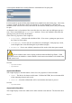
dojox/mobile/RadioButton
This widget shows a radio button which can be checked or not checked.
When declaratively creating an instance of this widget, use the <input type="radio"> as the
container. This will cause the correct space for it to be allocated. For example:
<input type="radio"
name="gaugeType"
data-dojo-type="dojox/mobile/RadioButton"
data-dojo-value="Circular" />
Some of the key properties of this widget are:
• checked – Is this radio button checked?
• value – The value of this button if it is checked and submitted as a form.
• name – The name of a group to associate together radio buttons so that only one is selected.
Page 240