
Consumption Monitoring
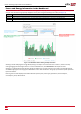
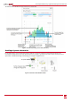
Table Of Contents

Power and Energy Information in the Dashboard
The site dashboard screen in the cloud-based monitoring platform displays power and energy information for a week, month
and year. The information is graphically displayed in three panes using the following color-codes (see Figure 2):
Color Description
Light blue Self-consumption - the PVenergy consumed by the site; value and percentage out of the produced / consumed energy
Dark green System Production- the produced PVenergy, with value and percentage of exported energy to the grid; out of the produced energy
Red Consumption - the PVenergy purchased from the grid; value and percentage out of the consumed energy
Figure 2: The dashboard window showing monthly information
Zooming-in allows analyzing the energy data by drilling-in as deep as 15-minute intervals. To zoom-in, select an area by
clicking, dragging and releasing the mouse. To return to default zoom, click Reset Zoom at the top of the chart.
Zooming-in in the Month and Year tabs will change the display from a column chart to an area chart. For StorEdge systems ,
an additional light-green colored graph is added to the screen:Solar Production. This graph represents the power produced
by the PVmodules.
Hovering over the chart displays information about the specific point: power type (production, self consumption,
consumption), value, date and time.
2
Power and Energy Information in the Dashboard