
Application Guide
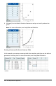

A summary table contains an X (or Y) List and a Summary List.
• The X (or Y) List contains numeric or string values (such as 1999 or “color”).
Numeric values result in a histogram. String values identify the categories for a bar
chart.
• The Summary List contains numeric values (such as count, frequency, or
probability) for each element in the other list.
To Create a Summary Plot:
Note: For situations in which you already have a summary table, you can skip the first
two steps.
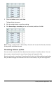
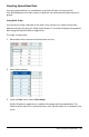
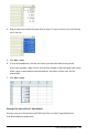
1. Create a list that holds the category identifiers. For this example, name the list
“color” and type strings for eye color. Enclose category names in quotes to prevent
them from being interpreted as variables.
2. Create the summary list. For this example, name the list “counts” and type the
total count for each of the eye colors.
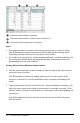
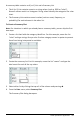
3. Select either list by clicking the top cell of the column and pressing▲.
4. From the Data menu, select Summary Plot.
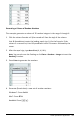
The Summary Plot dialog box opens.
Lists&Spreadsheet Application 317