
Application Guide

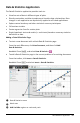
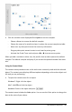

The default plot for two variables is a scatter plot. The data points shift to
represent the elements of both variables as a scatter plot.
5. (Optional) Repeat Steps 1-3 to choose additional variables to plot on the vertical
axis.
The name of each variable that you add is appended to the label on the axis. The
default data point shape changes to help you distinguish data, and a legend is
displayed to identify the shapes.
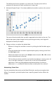
6. Change, analyze, or explore the plotted data.
- Remove or change the variable on an axis by clicking the Add Variable region
again.
- View the plotted data in another supported plot type by selecting a tool from
the Plot Typesmenu.
- Choose the Graph Trace tool on the Analyze menu and press ◄or► to move
across the data points in the plot.
- The lists that you plot as variables can include incomplete or missing cases. (A
case is the data contained in a row of cells in the Lists&Spreadsheet
application.) The Lists&Spreadsheet application displays a void as an
underscore (“_”), and Data&Statistics plots no data point for a void cell.
Manipulating Plotted Data
You can manipulate data points on the Data&Statistics work area to explore their
effects. For example, you could explore how a specific group of values affects the
median.
Data&Statistics Application 349