
Application Guide


354 Data&Statistics Application
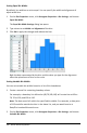
- You can create a box plot with frequency by choosing Add X Variable or Add Y
Variable on the Plot Properties menu.
- You can specify a variable multiple times as you choose variables to plot as box
plots.
- The variable used to provide frequency information is added to the label on the
horizontal axis in the format: x_variablename{frequencylist_name}.
4. Point and click the regions of the box plot to explore and analyze the data it
represents.
- Hover over a region or over a whisker to display the details for the portion of
the plot that interests you. The label for the quartile that corresponds to your
selection is displayed.
- Click a region of the box plot to select the data points or whiskers. Click again
to remove the selection.
- You can select any box plot that does not include frequency data and choose
Dot Plot on the context menu to change the plot type.
- Drag a selection to move it and explore other possibilities for the data.
- Use the arrow keys to move a data point one pixel at a time.
- Activate the Graph Trace tool and press ◄or► to move across dots and
regions of the plot. As the trace cursor moves, the values for Q1, the median,
Q3, and whisker ends/outliers are displayed.
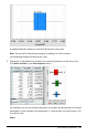
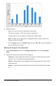
5. Change the plot from a modified box plot to a standard box plot by choosing Extend
Box Plot Whiskers on the Plot Properties menu.
The box plot is redrawn as a standard box plot with extended whiskers.
The standard box plot’s whiskers use the minimum and maximum points in the
variable and outliers are not identified. The whiskers on the plot extend from the
minimum data point in the set (x-min) to the first quartile (Q1) and from the third
quartile (Q3) to the maximum point (x-max). The box is defined by Q1, Med
(median), and Q3.
Note: You can click Show Box Plot Outliers on the Plot Properties menu to return to
the modified box plot.