
Application Guide


360 Data&Statistics Application
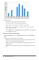
- Click to select a data point. Click again to deselect it.
- Click multiple data points to select them.
- Activate the Graph Trace tool and press ◄or► to move across the data
points and display values.
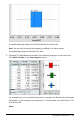
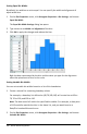
Creating a Scatter Plot
A scatter plot shows the relationship between two sets of data. You can also plot a
scatter plot by using the Quick Graph tool in the Lists&Spreadsheet application.
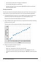
1. In the Data&Statistics work area, click the Add Variable region and select the
variable that contains the data you want to see represented on an axis.
The plot of the selected variable displays on the axis.
2. Click the Add Variable region of the other axis and select the variable containing
the data you want to plot.
The data points shift to represent the data in the selected variable.
3. Analyze and explore the data in the plot.
- Click a point to select it.
- Hover over a data point to view the summary data.
- Work with the data using the available tools on the Analyze menu. For
example, choose the Graph Trace tool and press ◄or► to move across the
plot.