
Application Guide

362 Data&Statistics Application
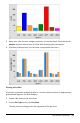
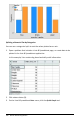
• Bar Chart
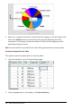
• Pie Chart
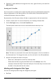
The categorical plot types can be used to compare the representations of data across
different plots. When the same variable (list) is used for a dot chart and a bar chart or
pie chart in a problem, selecting a data point or segment in one of the plots selects the
corresponding data point, segment, or bar in all other plots that include the variable.
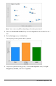
Creating a Dot Chart
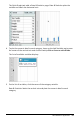
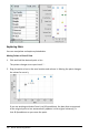
The default plot type for categorical data is the dot chart.
When one variable is plotted, the value of each cell is represented as one dot, and the
dots are stacked at the point on the axis that corresponds to the cell value.
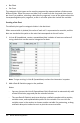
1. In Lists&Spreadsheet, create a spreadsheet that includes at least one column of
string values that can be used as categories for data.
Note: To type a string in Lists&Spreadsheet, enclose the characters in quotes.
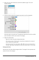
2. Add a Data&Statistics page to the problem.
Notes:
- You can also use the Lists&Spreadsheet Quick Graph tool to automatically add
a Data&Statistics page and plot the selected column.
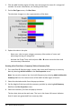
- The new Data&Statistic work area displays a default caseplot with a caption,
variable name, and unplotted data points for the variable. You can click the
variable name in the caption to choose another variable for previewing, or drag
a default data point toward an axis to plot the current variable.