
Application Guide
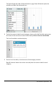

3. Move near the center of either axis and click the Add List region. The list of
variables displays.
4. Click the list that contains the categories you want to use for sorting data.
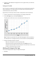
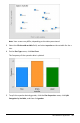
A dot chart plots in the work area. The application labels the axis with the variable
name and shows a dot for each instance of a category.
5. Explore the plotted data.
- Hover over a dot in the plot to display data values.
- Click a dot to select it. Click the dot a second time to deselect it or remove it
from a selection of multiple dots.
- Activate the Graph Trace tool and press ◄or ► to move across the points in
list order. Dots display a bold outline as you move across them in Trace mode.
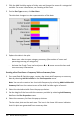
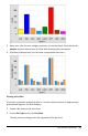
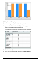
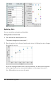
Creating a Bar Chart
Like dot charts, bar charts display categorical data. The length of a bar represents the
number of cases in the category.
Data&Statistics Application 363