
Application Guide

364 Data&Statistics Application
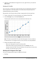
1. Click the Add Variable region of either axis and choose the name of a categorical
variable. For more information, see Creating a Dot Chart.
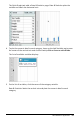
2. On the Plot Types menu, click Bar Chart.
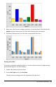
The dot chart changes to a bar representation of the data.
3. Explore the data in the plot.
- Hover over a bar to see a category summary (the number of cases and
percentage among all categories).
- Activate the Graph Trace tool and press ◄or ► move across the bars and
view summary information.
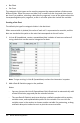
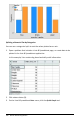
Creating a Bar Chart from a Frequency Table or Summary Data
1. On a new Data&Statistics page, create a bar chart with frequency or summary
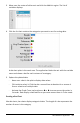
data by choosing Add X Variable on the Plot Properties menu.
Note: You can also create a bar chart with frequency by selecting Add Variable with
Summary List from the context menu of the Add Variable region of an axis.
2. Select the desired variable from the pop-up choices.
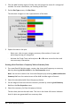
3. Set the height of the bars with the summary variable by selecting Add Summary
List from the Plot Properties menu.
4. Select the summary list from the pop-up choices.
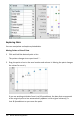
The bar chart plots on the work area. The icon in the lower left corner indicates
that this plot was generated from summary data.