
Application Guide
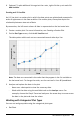
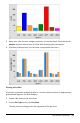
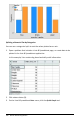
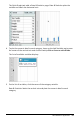

5. Hover over a bar to see a category summary, or use the Graph Trace tool on the
Analyze menu to move across all of the bars displaying the summaries.
6. (Optional) Add summary lists to create a comparative bar chart.
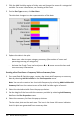
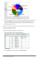
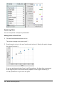
Creating a Pie Chart
A pie chart represents categorical data in a circular layout and uses an appropriately
proportioned segment for each category.
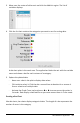
1. Create a dot chart on the work area.
2. On the Plot Types menu, click Pie Chart.
The dots move by category into the segments of the pie chart.
Data&Statistics Application 365