
User Manual
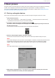
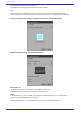
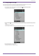
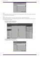
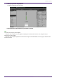
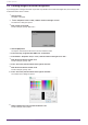
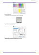
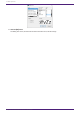
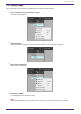
Table Of Contents
- ProVisionaire Control PLUS
- Contents
- 1. Introduction
- 2. Installation procedure
- 3. Screen structure
- 4. Basic process
- 4.1. Start up, and register devices
- 4.2. Placing widgets on a page
- 4.3. Labeling widgets for easier recognition
- 4.4. Adding a page
- 4.5. Specifying a background for the page
- 4.6. Adjusting the placement of the widgets
- 4.7. Saving the project file
- 4.8. Testing operation
- 4.9. Making security settings
- 4.10. Creating a controller file
- 5. Adding parameters and meters from apps other than ProVisionaire Control
- 6. Functions specific to initial mode
- 7. Title bar
- 8. Menu bar
- 9. Tool bar
- 10. “Controllers” area
- 11. “Devices” area
- 12. “Widgets” area
- 13. Work area
- 14. “Properties” area
- 15. Widgets
- 15.1. “Common widget items”
- 15.2. Recall Button
- 15.3. Page Control Button
- 15.4. Direct Set Button
- 15.5. On/Off Button
- 15.6. Inc/Dec Button
- 15.7. Direct Play Button
- 15.8. Play Info
- 15.9. Transport
- 15.10. Track List
- 15.11. Slider
- 15.12. Dial
- 15.13. Value
- 15.14. Line Edit
- 15.15. Meter
- 15.16. Indicator
- 15.17. Line
- 15.18. Rectangle / Ellipse / Polygon
- 15.19. Image
- 15.20. System Monitor
- 15.21. Contact List / Recent List / Dialer
- 15.22. SourceAndPGM / Album Art
- 16. Dialog boxes and windows
- 16.1. “Setup” dialog box
- 16.2. “New Project Wizard” dialog box
- 16.3. “Add Controller” dialog box
- 16.4. “Auto Page Change” dialog box
- 16.5. “Run Controller File” dialog box
- 16.6. “Select Controllers to Import” dialog box
- 16.7. “Export Controller File” dialog box
- 16.8. “Imported Images” dialog box
- 16.9. “Add Device” dialog box
- 16.10. “Target Editor” dialog box
- 16.11. “Edit Text” dialog box
- 16.12. “Edit Device Identifier” dialog box
- 16.13. “Select Image” dialog box
- 16.14. “Style” dialog box
- 17. Tips
- 18. Troubleshooting
-

4.3. Labeling widgets for easier recognition
If you simply place a widget, Kiosk will not provide any indication as to what that widget does; here’s how to add
a label that will be shown in Kiosk.
1.
Click the slider.
The slider is selected.
2.
「In the “Properties” area’s “Label,” click the column at the right of “Text.”
The “Edit Text” dialog box opens.
3.
Enter a name for the slider.
For this example, specify “DM7-CH1.”
4.
Click the [OK] button.
The input is confirmed, and the name is shown below the slider.
5. In the same way, assign the label “DM7-CH1” to the button.
6. In the button’s “Properties” area, in “Text,” click the column at the right of “On Text.”
7.
Enter the text for when the button is on.
For this example, specify “ON.”
8. In the “Text” area, click the column at the right of “Off Text.”
9.
Enter the text for when the button is off.
For this example, specify “OFF.”
10.
In the “Text” area, click the column at the right of “Off Color.”
The “Select Color” dialog box opens.
11.
Select a different text color for when the button is off.
For this example, select yellow.
4. Basic process
16 | ProVisionaire Control PLUS V1.0 User Guide