
User Manual
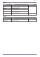
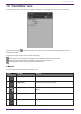
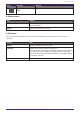
Table Of Contents
- ProVisionaire Control PLUS
- Contents
- 1. Introduction
- 2. Installation procedure
- 3. Screen structure
- 4. Basic process
- 4.1. Start up, and register devices
- 4.2. Placing widgets on a page
- 4.3. Labeling widgets for easier recognition
- 4.4. Adding a page
- 4.5. Specifying a background for the page
- 4.6. Adjusting the placement of the widgets
- 4.7. Saving the project file
- 4.8. Testing operation
- 4.9. Making security settings
- 4.10. Creating a controller file
- 5. Adding parameters and meters from apps other than ProVisionaire Control
- 6. Functions specific to initial mode
- 7. Title bar
- 8. Menu bar
- 9. Tool bar
- 10. “Controllers” area
- 11. “Devices” area
- 12. “Widgets” area
- 13. Work area
- 14. “Properties” area
- 15. Widgets
- 15.1. “Common widget items”
- 15.2. Recall Button
- 15.3. Page Control Button
- 15.4. Direct Set Button
- 15.5. On/Off Button
- 15.6. Inc/Dec Button
- 15.7. Direct Play Button
- 15.8. Play Info
- 15.9. Transport
- 15.10. Track List
- 15.11. Slider
- 15.12. Dial
- 15.13. Value
- 15.14. Line Edit
- 15.15. Meter
- 15.16. Indicator
- 15.17. Line
- 15.18. Rectangle / Ellipse / Polygon
- 15.19. Image
- 15.20. System Monitor
- 15.21. Contact List / Recent List / Dialer
- 15.22. SourceAndPGM / Album Art
- 16. Dialog boxes and windows
- 16.1. “Setup” dialog box
- 16.2. “New Project Wizard” dialog box
- 16.3. “Add Controller” dialog box
- 16.4. “Auto Page Change” dialog box
- 16.5. “Run Controller File” dialog box
- 16.6. “Select Controllers to Import” dialog box
- 16.7. “Export Controller File” dialog box
- 16.8. “Imported Images” dialog box
- 16.9. “Add Device” dialog box
- 16.10. “Target Editor” dialog box
- 16.11. “Edit Text” dialog box
- 16.12. “Edit Device Identifier” dialog box
- 16.13. “Select Image” dialog box
- 16.14. “Style” dialog box
- 17. Tips
- 18. Troubleshooting
-

Property Value
Widgets (displayed when used with ProVisionaire Kiosk)
[Show Widget Selection Border] Select Yes to display a frame around the widget to indicate that it is
selected.
[Offline Indication] Select Yes to display an indicator in the top right corner of the widget,
showing the online status of the device that has the parameters.
[No Assign Indication] Select Yes to display a clip in the top right corner of widgets to which no
device parameters are assigned.
Property Value
Controller
These are the same setting as Properties > pages under Controller.
Page
[Name] The name of the page. Click this to edit it.
[Comment] A comment for the page. When you click this, the “Edit Text” dialog box
opens, allowing you to edit the comment.
[HOME Page]
Yes is displayed when the page is set as the home page.
You can set this property in the following places:
・[Set as HOME] in the menu that appears when you right-click on a page
in the Devices area
・Properties > Auto Page Change under Controller
[Fallback Page]
Yes is displayed when the page is set as the fallback page.
You can set this property in the following places:
・[Set as Fallback] in the menu that appears when you right-click on a
page in the Devices area
・Properties > Auto Page Change under Controller
[Power User Code Required] Select Yes to authenticate with a Power User code when navigating to this
page in Kiosk.
Editing is not possible when specified on the home page.
[Background Color] The background color of the page. When you click the square, the “Select
Color” dialog box opens, allowing you to select a background color.
[Background Image] The background image of the page. When you click the square, the “Select
Image” dialog box opens, allowing you to select image data that will be
shown above the background color. If you click the trash can button, the
background image settings are discarded.
[Scaling] Sets the reduction ratio of the image.
[Image Expansion Mode] Specifies how the background image is shown. For details on this setting,
refer to 「About the Expansion Mode」
[Snap to Grid] Selects whether widgets will be aligned with the grid (Yes) or can be
placed freely (No).
[Dot Color] The color of the grid’s dots. When you click the square, the “Select Color”
dialog box opens, allowing you to select the dot color.
10. “Controllers” area
46 | ProVisionaire Control PLUS V1.0 User Guide