
User Manual
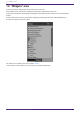
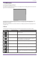
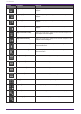
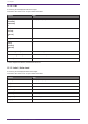
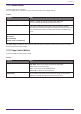
Table Of Contents
- ProVisionaire Control PLUS
- Contents
- 1. Introduction
- 2. Installation procedure
- 3. Screen structure
- 4. Basic process
- 4.1. Start up, and register devices
- 4.2. Placing widgets on a page
- 4.3. Labeling widgets for easier recognition
- 4.4. Adding a page
- 4.5. Specifying a background for the page
- 4.6. Adjusting the placement of the widgets
- 4.7. Saving the project file
- 4.8. Testing operation
- 4.9. Making security settings
- 4.10. Creating a controller file
- 5. Adding parameters and meters from apps other than ProVisionaire Control
- 6. Functions specific to initial mode
- 7. Title bar
- 8. Menu bar
- 9. Tool bar
- 10. “Controllers” area
- 11. “Devices” area
- 12. “Widgets” area
- 13. Work area
- 14. “Properties” area
- 15. Widgets
- 15.1. “Common widget items”
- 15.2. Recall Button
- 15.3. Page Control Button
- 15.4. Direct Set Button
- 15.5. On/Off Button
- 15.6. Inc/Dec Button
- 15.7. Direct Play Button
- 15.8. Play Info
- 15.9. Transport
- 15.10. Track List
- 15.11. Slider
- 15.12. Dial
- 15.13. Value
- 15.14. Line Edit
- 15.15. Meter
- 15.16. Indicator
- 15.17. Line
- 15.18. Rectangle / Ellipse / Polygon
- 15.19. Image
- 15.20. System Monitor
- 15.21. Contact List / Recent List / Dialer
- 15.22. SourceAndPGM / Album Art
- 16. Dialog boxes and windows
- 16.1. “Setup” dialog box
- 16.2. “New Project Wizard” dialog box
- 16.3. “Add Controller” dialog box
- 16.4. “Auto Page Change” dialog box
- 16.5. “Run Controller File” dialog box
- 16.6. “Select Controllers to Import” dialog box
- 16.7. “Export Controller File” dialog box
- 16.8. “Imported Images” dialog box
- 16.9. “Add Device” dialog box
- 16.10. “Target Editor” dialog box
- 16.11. “Edit Text” dialog box
- 16.12. “Edit Device Identifier” dialog box
- 16.13. “Select Image” dialog box
- 16.14. “Style” dialog box
- 17. Tips
- 18. Troubleshooting
-

15. Widgets
This chapter describes widgets and parameters that are displayed in the “Properties” area when a widget is
selected.
15.1. “Common widget items”
15.1.1. General
Property Value
[Name] The name of the widget. If you place the widget first and assign a
parameter later, you can enter a name here to indicate the parameter that
you intend to assign.
[Type] The type of widget.
[Visible] When [No] is selected, the widget will not be displayed when Kiosk starts
up.
[Read Only] When [Yes] is selected, you will not be able to operate the widget when
Kiosk starts up. In this case, the widget acts like an indicator.
15.1.2. Control
Property Value
[Model] The model name of the device that has parameters, presets, etc.,
assigned to the widget.
[Device Identifier]
The search method for devices on the network.
Click here to change the method.
[Parameter Address] The address of the parameter assigned to the widget.
[Input Channel] The channel number of the parameter assigned to the widget.
[Confirmation] When [Yes] is selected, a confirmation message appears before Kiosk
executes the operation.
[Confirmation Text] Click here to edit the confirmation message.
15. Widgets
ProVisionaire Control PLUS V1.0 User Guide | 55