
User Manual
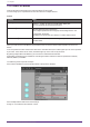
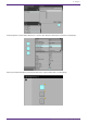
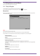
Table Of Contents
- ProVisionaire Control PLUS
- Contents
- 1. Introduction
- 2. Installation procedure
- 3. Screen structure
- 4. Basic process
- 4.1. Start up, and register devices
- 4.2. Placing widgets on a page
- 4.3. Labeling widgets for easier recognition
- 4.4. Adding a page
- 4.5. Specifying a background for the page
- 4.6. Adjusting the placement of the widgets
- 4.7. Saving the project file
- 4.8. Testing operation
- 4.9. Making security settings
- 4.10. Creating a controller file
- 5. Adding parameters and meters from apps other than ProVisionaire Control
- 6. Functions specific to initial mode
- 7. Title bar
- 8. Menu bar
- 9. Tool bar
- 10. “Controllers” area
- 11. “Devices” area
- 12. “Widgets” area
- 13. Work area
- 14. “Properties” area
- 15. Widgets
- 15.1. “Common widget items”
- 15.2. Recall Button
- 15.3. Page Control Button
- 15.4. Direct Set Button
- 15.5. On/Off Button
- 15.6. Inc/Dec Button
- 15.7. Direct Play Button
- 15.8. Play Info
- 15.9. Transport
- 15.10. Track List
- 15.11. Slider
- 15.12. Dial
- 15.13. Value
- 15.14. Line Edit
- 15.15. Meter
- 15.16. Indicator
- 15.17. Line
- 15.18. Rectangle / Ellipse / Polygon
- 15.19. Image
- 15.20. System Monitor
- 15.21. Contact List / Recent List / Dialer
- 15.22. SourceAndPGM / Album Art
- 16. Dialog boxes and windows
- 16.1. “Setup” dialog box
- 16.2. “New Project Wizard” dialog box
- 16.3. “Add Controller” dialog box
- 16.4. “Auto Page Change” dialog box
- 16.5. “Run Controller File” dialog box
- 16.6. “Select Controllers to Import” dialog box
- 16.7. “Export Controller File” dialog box
- 16.8. “Imported Images” dialog box
- 16.9. “Add Device” dialog box
- 16.10. “Target Editor” dialog box
- 16.11. “Edit Text” dialog box
- 16.12. “Edit Device Identifier” dialog box
- 16.13. “Select Image” dialog box
- 16.14. “Style” dialog box
- 17. Tips
- 18. Troubleshooting
-

15.17. Line
Control
Property Value
[Angle] Indicates the angle of the widget, relative to the bottom edge when the
widget is placed.
To change Angle, drag one of the squares that appear on both ends when
a widget is selected.
[Length]
Indicates the length of the widget.
To change Length, drag one of the squares that appear on both ends
when a widget is selected.
[Style] Selects the style of the widget.
15.18. Rectangle / Ellipse / Polygon
These widgets are convenient for placing titles or comments. In addition to text, you can also assign a logo or
other image.
For Properties, refer to “Common widget items.”
15.19. Image
This item displays svg, png, bmp, jpg, and jpeg image files.
When the widget is placed, the “Select Image” dialog box appears.
After placing the widget, you can change the settings by clicking an image in the Value field of [Image] under
Properties.
Click the trash can button in the Value field of [Image] to cancel display of the corresponding image.
In this case, the image will not be deleted but will remain in the project file. To delete an image from within the
file, delete it using the “Imported Images” dialog box.
15.20. System Monitor
This item allows you to check the device operation information collected by “ProVisionaire Edge.” The color will
change if a device failure occurs.
Set which ProVisioniare Edge to collect information from in Log under the Setup menu.
For Properties, refer to “Common widget items.”
For information about “ProVisionaire Edge,” refer to the “ProVisionaire Edge User Guide.”
15.21. Contact List / Recent List / Dialer
This is a widget related to RM-CR.
For Properties, refer to “Common widget items.”
15.22. SourceAndPGM / Album Art
This is a widget related to MusicCast.
For Properties, refer to “Common widget items.”
15. Widgets
ProVisionaire Control PLUS V1.0 User Guide | 67