User’s Manual DX1000/DX1000N/DX2000 Custom Display IM 04L41B01-04E 3rd Edition
Thank you for purchasing DX1000/DX1000N/DX2000 (Hereafter, called “DX”). This manual explains the custom display function of DX. Read this manual thoroughly in advance to use this function properly. Moreover, read it together with User’s Manuals IM04L41B01-01E or IM04L42B01-01E. Notes Trademarks ● The contents of this manual may change without prior notice in view of improving the performance and function. ● We ensure the contents of this manual.
How to Use This Manual Structure of the Manual Before reading this manual, read the Operation Guide and User’s Manual to understand the basic operations. This manual consists of the following three chapters, an appendix, and an index. Chapter 1 Title and description Overview and Basic Operations Explains the basic operations for configuring the custom display. 2 Advanced Settings of Screen and Component Explains the attribute of each component.
Revision History Document name: Document number: IM 04L41B01-04E DX1000/DX1000N/DX2000 Custom Display User’s Manual IM 04L41B01-04E Edition 1st 2nd Revised November, 2008 March, 2010 3rd December, 2010 Revisions, DX recorder series number New, R3 Added components, R4 Components added: Group name, System icon, Memory bar, Time label, Batch group number, Batch name, and Modbus In. Added attributes, R4 (firmware version 4.
Contents How to Use This Manual................................................................................................................... ii Revision History............................................................................................................................... iii Chapter 1 Chapter 2 iv Overview and Basic Operations 1.1 1.2 1.3 1.4 1.5 1.6 1.7 1.8 1.9 1.10 1.11 1.12 1.13 Overview...........................................................................................
Contents 2.30 2.31 2.32 Chapter 3 Appendix Attributes of Comment Block Components................................................................... 2-56 Attributes of Communication Input Components........................................................... 2-58 Attributes of Modbus In Components............................................................................ 2-60 2 Saving and Reading Screen Data 3.1 3.2 Saving Screen Data...................................................................
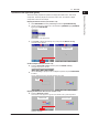
Chapter 1 Overview and Basic Operations 1.1 Overview 1 Builder screen App RUN PNL soft key FUNC key Builder soft key Index Configure a screen. Status area Screen construction area If the status area is set to No Display, the screen construction area becomes larger.
1.1 Overview Execution Screen Display a configured screen as an operation screen. With the Runtime menu of screen attributes turned Off With the Runtime menu of screen attributes turned On For information on the Runtime menu of screen attributes, see section 2.1. When you turn On the Runtime menu of the screen attributes in the builder screen, the Builder and MENU soft keys are displayed in the execution panel. See Section 2.1: These keys are not displayed in the factory default setting.
1.1 Overview 1 Operation Flow (operation guide) Overview and Basic Operations This section briefly explains the operation to display the builder screen, then create components, and finally display the execution screen. Here, the creation of digital components is taken as an example. 2 Display the builder screen (see section 1.2) 1. Press DISP/ENTER and use any arrow keys to select the [CUSTOM DISPLAY]. 2.
1.2 Display the Builder Screen Procedure 1. Press DISP/ENTER. The screen menu appears. 2. Use the up and down arrow keys to select the CUSTOM DISPLAY, and press the right arrow key. The submenu appears. 3. Use the up and down arrow keys to select one of the submenus, [INTERNAL 1] to [INTERNAL 3], and press the DISP/ENTER. The execution screen appears. 4. Use the FUNC to display the Builder soft key on the function menu.
1.2 Display the Builder Screen 1 The builder screen appears. Overview and Basic Operations 2 3 Note App [Builder screen] on the function menu • This might not be displayed depending on the user restriction setting. • If key lock is activated, selecting this key will return an error. Index Explanation The submenu shows screen names registered in the internal memory and external storage media (CF card).
1.3 Set Grid (Cursor Movement Interval) Cursor moves at defined grid intervals. No grid appears on the screen. Procedure 1. Press the GRID soft key. The grid interval menu appears. 2. Press the soft key for a grid interval to be set. You can move the cursor at the defined grid intervals. Explanation Range of Grid Setting You can select the grid from 1, 5, 10, 20, and 50 dots. Setting the upper left-hand corner of the builder screen as an origin, the grid is set at defined dot intervals.
1.4 Create Components 1 Procedure 1. Use the arrow key to move the cursor to the point where you want to create components. You may move the cursor after creating components. Overview and Basic Operations For details of each component, see “Chapter 2. Advanced Settings of Screen and Component.” 2 3 2. Press the TOOL BOX soft key. The soft key menu for each component appears. 3. Press the soft key for components to be created. 4.
1.4 Create Components Component List The order of the following parts is the order of soft keys displayed when creating DX recorder parts. 1-8 Digital Bar You can set items to display on the vertical and horizontal axes. Trend You can set items to display on the vertical and horizontal axes. Scale You can set items to display on the vertical and horizontal axes. Switch You can select from nine different switch types. Label You can specify vertical or horizontal direction.
1.4 Create Components 1 ID Number of Components Component type Component name Update cycle ID number Components for channel assignment Digital Bar Tag No. Tag comment (Tag) Simple digital Simple bar Alarm mark Unit Alarm indicator Span L Span U System icon Memory bar Time label Batch group number Batch name Group name Label Push button Switch COMM IN Modbus In 1 sec. 1 sec. None None 1 sec. 1 sec. 1 sec. None 1 sec. None None 1 sec. 1 sec. 1 sec.
1.4 Create Components Display When Components Overlap on the Execution Screen Limitations (A, B, and C) apply when components overlap on the execution screen. If components with the same overlap restriction are overlapping, components placed under the front component (i.e., in the background) are not displayed. Overlap restriction None Component name (attribute conditions) Digital, bar, scale (kind: OFF), label, tag No.
1.5 Move Components 1 Overview and Basic Operations 2 Procedure 1. Use the arrow key to place the cursor on the component which you want to move. 2. Press the MOVE soft key. The movement frame (the component frame becomes a dashed line: 3 ) is displayed. 3. Use the arrow key to move the movement frame to the point where you want to place a component. App Index 4. Press DISP/ENTER. The component moves to the specified point.
1.6 Change the Component Size Procedure 1. Use the arrow key to place the cursor on the component whose size you want to change. 2. Press the RESIZE soft key. The component size frame (the component frame becomes a dashed line: ) is displayed. 3. Use the arrow key to manipulate the component size frame and determine the size. 4. Press DISP/ENTER. The component size is changed. Explanation The upper left of a component is fixed as origin. The size changes rightward and downward.
1.7 Display the Attribute Setting Dialog of Components 1 Overview and Basic Operations For details of each component, see “hapter 2. Advanced Settings of Screen and Component.” 2 Procedure 1. Use the arrow key to place the cursor on a component. 3 App 2. Press the PROPERTY soft key. Index The simple attribute setting dialog appears. 3. Use the arrow key to select the Details button and press DISP/ENTER. The detail attribute setting dialog appears.
1.8 Copy Components (Copy and Paste) Procedure 1. Use the arrow key to place the cursor on the component which you want to copy. 2. Press the COPY soft key. 3. Use the arrow key to move the cursor to the point where you want to place a component. 4. Press the PASTE soft key. Copied components are pasted. Explanation All contents to be copied are attribute information excluding the ID, depend ID, group control, and Gr.ctrl order.
1.9 Change the Component Arrangement Order 1 Overview and Basic Operations You can change the arrangement of a specified component to the front or back. 2 Procedure 1. Use the arrow key to place the cursor on the component whose arrangement order you want to change. 3 App Index 2. Press the ORDER soft key. The soft key menu (ToFRONT, ToBACK, ToTOP, ToBOTTOM, BACK) appears. 3. Press the relevant soft key. Components are arranged in accordance with the selected soft key.
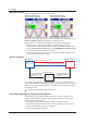
1.10 Have the Visibility Attribute of a Component Depend on Another Component This section explains the operation using the soft key. It is also possible to set dependency based on individual components attributes. See Chapter 2. Procedure 1. Use the arrow key to place the cursor on the component which you want to subordinate (A). 2. Press the DEPEND soft key. The soft key menu appears. (A) (B) 3. Press the DEPEND soft key. 4.
1.10 Have the Visibility Attribute of a Component Depend on Another Component 1 Explanation Builder screen (A) Depending Execution screen (C) App Index If a depended component is subordinated to another component: If a depended component is subordinated to another component, the original dependency relationship is contained in the newly created depending component. In the case of the figure below, components A and B depend on component C.
1.11 Register Components in the GR. CTRL It is a function that switches the display of components created by each display group. In the Gr. Ctrl dialog, you will be able to list or edit the settings configured by attribute of each component. This section explains the operation using the soft key menu. You will configure the group control based on individual component’s attributes. See Chapter 2 and Appendix 1. Procedure 1. Pres the Gr. Ctrl soft key. 2.
1.11 Register Components in the GR. CTRL Order It is an order of channel configured for each display group. For example, if “003, 004, 005” is configured for display group 1, the order 1 of group number 1 is CH3, the order 2 corresponds to CH4, and the order 3 corresponds to CH5 respectively. Setting range: 1 to 6 for DX1000 and 1 to 10 for DX2000 Here is the explanation using the display group setting and the dialog below as an example.
1.11 Register Components in the GR. CTRL Example for Group Control Settings In the screen showing a bar graph of the measured values from 2 channels, the measured values displayed depend on the display groups as follows: display group 1 = ch 1 and ch 2; display group 2 = ch 3 and ch 4; display group 3 = ch 5 and ch 6; display group 4 = ch 7 and ch 8.
1.11 Register Components in the GR. CTRL 1 Group Control Settings Overview and Basic Operations Group control is set up in the attribute dialog boxes of each individual component. Tag (ID:0) attribute setting dialog box 2 Uses GR. CRTL 1. Because this component is associated with the first registered channel of each display group, set 1. 3 The settings can be displayed in the GR. CTRL. dialog box. They can also be edited. This is the group number displayed when moving to the execution screen.
1.12 Delete Components To delete components, you delete either a specified component (one component) or all components on the screen. Procedure To Delete a Specified Component: 1. Use the arrow key to place the cursor on the component which you want to delete. 2. Press the DELETE soft key. The confirmation dialog appears. Kind and ID number of the component to be deleted 3. Use the arrow key to select [OK] and press DISP/ENTER. The specified component is deleted.
1.13 Other Operations 1 Overview and Basic Operations To Display the Execution Screen: 2 Press the RUN PNL soft key. The execution screen appears. Builder screen Execution screen 3 App Index To Go Back to the Builder Screen: Press FUNC, and press the Builder soft key. If the screen attribute runtime menu is on, the soft key menu is displayed on the lower left hand on the execution screen. Then, press the Builder soft key.
1.13 Other Operations To Update an Edited Screen: When editing the internal memory data displayed on the custom screen submenu, the screen data is saved in the internal memory. But if editing data in an external storage medium, if you attempt to move to another screen, a message appears. For an explanation of data from internal and external storage media, see section 1.2. After editing the [Create], or [EXTERNAL 1] through [EXTERNAL 25] screens, be sure to update the screen.
Chapter 2 2.1 Advanced Settings of Screen and Component Screen Attribute 1 This section shows you how to configure attributes associated with screen name, base color and runtime menu. 1. On the builder screen, place your cursor in an area where there is no component. 2. Press the PROPERTY soft key. Screen attribute setting dialog appears. Advanced Settings of Screen and Component Precedure 2 3 App Index 3. Configure each attribute.
2.2 Common Attributes of Components This section explains the common attributes used for multiple components. Attribute Settings To fix the setting value, select [OK] in the attribute setting dialog after you have changed the settings of component attributes. Selection You will see a selection [SET] in the attribute settings. This indicates a value configured at the setting menu of this device. Font The following character types are available.
2.2 Common Attributes of Components Visible You can choose to show or hide the components on the execution screen. On: Show components on the execution screen and builder screen. Off: Hide components on the execution screen. Components will be visible on the builder screen. You will not be able to change this setting if a component is depending on other components. 2 3 You can configure settings of display group control status. Setting range You can select [None], [GR. CTRL 1], [GR. CTRL 2], [GR.
2.2 Common Attributes of Components 2nd span This is the attribute available with trend components and scale components only. You can enlarge the display of trend and scale by synchronizing the On/Off settings of alarm or internal switch. To validate the 2nd span, configure [2nd span] at the synchro attribute field. Scale and trend shown in the below figure are an example of displaying the 2nd span when the alarm is set to On. (Example of settings) • 2nd span: On; 2nd span Lower: 85.
2.3 Attributes of Digital Components 1 These components are associated with displaying digital values. You can display digital value, tag (tag no., tag comment, or channel no.), unit, and alarm display mark. Channel assignment Overlap restriction (See Section 1.4.) None Update cycle 1 sec. 3 Name of Each Component Tag No. / Tag (Tag comment) / Channel No.
2.3 Attributes of Digital Components Attribute Unit display Frame Depend ID Visible Group control Gr.Ctrl order Sync act 2-6 Description You can choose to show or hide the unit display by setting [On] or [Off]. Set the frame of a component. See Section 2.2. Set the ID number of the component on which this component is dependent. See Section 2.2. You can choose to show or hide this component by setting [On] or [Off]. See Section 2.2. Set the control status of group displayed. See Section 1.
2.4 Attributes of Bar Graph Components 1 These components are associated with displaying a bar graph. You can display tag no., tag comment, channel no., span, unit, alarm display mark, and alarm set-point mark. Components for channel assignment Overlap restriction (See Section 1.4.) None Update cycle 1 sec. 3 Name of Each Component Tag comment (only vertical) (Tag No.: On) Tag / Channel No. (only vertical) (Tag No.: Off) Tag No. / Channel No. (only vertical) (Tag No.
2.4 Attributes of Bar Graph Components Attribute Tag font (Displayed only when Tag No. is set to On.) Digital font Unit font Span font Bar color Base position Direction Alarm display Alarm mark display Digital display Unit display Span display 2 Line display Frame Depend ID Visible Group control Gr.Ctrl order Sync act 2-8 Description Set the character size of tag comment. (Available font types are same as those for channel font.
2.5 Attributes of Trend Components 1 These components are associated with displaying a trend. You can select either [Vertical] or [Horizon] for the wave direction. Trend display Overlap restriction (See Section 1.4.) C Update cycle Display update rate 3 Name of Each Component Direction: Horizontal 2 Advanced Settings of Screen and Component Component type (See Section 1.4.
2.5 Attributes of Trend Components List of Attributes Attribute ID Batch group no Description Number automatically assigned for component identification. Set the batch group number. The batch number needs to be within the range from [1] to number of Multi batch configured at the basic settings. only with additional The batch group number will be displayed only when Multi batch is spec. /BT2 valid. Group no Set the group number.
2.5 Attributes of Trend Components Attribute Time grid display Depend ID Sync act Default value On 2 None On 3 Note • • Depending on the display method, it may take time until the trend components in created custom display screens are displayed. To reduce the time, do the following. • If all channel display is turned On, turn it Off. • If displayed data is compressed along the time axis, lower the compress ratio or reduce the number of trend components.
2.6 Attributes of Scale Components These components are associated with displaying a scale. You can set vertical and horizontal direction. Component type (See Section 1.4.) Scale Overlap restriction (See Section 1.4.
2.6 Attributes of Scale Components List of Attributes Attribute ID Batch group no IM 04L41B01-04E Default value 88 to 91 1 1 2 Advanced Settings of Screen and Component Description Number automatically assigned for component identification. Set the batch group number. The batch number needs to be between [1] and number of Multi batch configured at the basic settings. only with additional The batch group number will be displayed only when Multi spec. /BT2 batch is valid. Group no Set the group number.
2.6 Attributes of Scale Components Attribute 2nd span Upper Depend ID Visible Sync act Description Enter a value between 0.0% for the lower limit and 100.0% for the upper limit. In this case, the difference between the two spans needs to be 10.0% or greater. See Section 2.2. Set the ID number of the component on which this component is dependent. See Section 2.2. You can choose to show or hide this component by setting [On] or [Off]. See Section 2.2. See Section 2.2. Default value 100.
2.6 Attributes of Scale Components • When selecting [Balanced] for the mark format If there are channels of the same scale position, they are assigned with mark formats of left (waveform direction vertical), or up (waveform direction horizontal). In this case, if the number of channels with the same channel position is 3 or less (scale format [Small]), or 5 or less (scale format [Large]), it is assigned alternately.
2.7 Attributes of Switch Components These components are associated with displaying a switch. You will be able to turn the event level switch [On]/[Off] on the execution screen. Component type (See Section 1.4.) Components with action functions Overlap restriction (See Section 1.4.
2.7 Attributes of Switch Components List of Attributes Attribute ID Style Action prompt Font String display Gap Color On color Off color On string Off string Frame Depend ID Visible Sync act IM 04L41B01-04E Default value 0 to 79 1 2 Selector Advanced Settings of Screen and Component Event level switch Description Number automatically assigned for component identification. Set the type of switch.
2.8 Attributes of Label Components These components are associated with displaying a label. Strings configured will be displayed. Component type (See Section 1.4.) Label Overlap restriction (See Section 1.4.) None Update cycle None Name of Each Component Label display area Vertical display: On Label (string) Attribute Setting Dialog List of Attributes Attribute ID Description Number automatically assigned for component identification. Text label Set the string to be displayed.
2.8 Attributes of Label Components Attribute Vertical display Frame Visible Sync act Default value Off 1 2 None None Advanced Settings of Screen and Component Depend ID Description Sets whether or not to display the tag number vertically. [On]: Rotates the text label 90 degrees clockwise. [Off]: Displays the text label horizontally. Set the frame of a component. See page 2-2. Set the ID number of the component on which this component is dependent. See Section 2.2.
2.9 Attributes of Tag No. Components These components are associated with displaying Tag No. (Soft key menu will be displayed when you set the Tag No. to [Yes] at the basic setting mode.) Component type (See Section 1.4.) Channel assignment Overlap restriction (See Section 1.4.) None Update cycle None Name of Each Component Tag No. display area Vertical display: On Tag No.
2.9 Attributes of Tag No. Components Attribute Gap 2 Line display Vertical display Depend ID Visible Group control Gr.Ctrl order Sync act IM 04L41B01-04E Default value 0 Off 1 2 Off Advanced Settings of Screen and Component Frame Description Set the character gap of the string. You can set a value between 0 and 15. You can choose to display the tag no. in two lines by setting [On] or [Off]. Sets whether or not to display the tag number vertically. [On]: Rotates the text label 90 degrees clockwise.
2.10 Attributes of Tag Comment Components These components are associated with displaying tag comment (tag). Component type (See Section 1.4.) Channel assignment Overlap restriction (See Section 1.4.) None Update cycle None Name of Each Component Tag comment display area Vertical display: On Tag comment (string) Attribute Setting Dialog List of Attributes Attribute ID Description Number automatically assigned for component identification Channel no Set the channel number to be assigned.
2.10 Attributes of Tag Comment Components Attribute Gap 2 Line display Vertical display Depend ID Visible Group control Gr.Ctrl order Sync act IM 04L41B01-04E Default value 0 Off 1 2 Off Advanced Settings of Screen and Component Frame Description Set the character gap of the string. You can set a value between 0 and 15. You can choose to display the tag comment in two lines by setting [On] or [Off]. Sets whether or not to display the tag comment vertically.
2.11 Attributes of Simple Digital Components These components are associated with displaying digital values. Component type (See Section 1.4.) Channel assignment Overlap restriction (See Section 1.4.) None Update cycle 1 sec Name of Each Component Simple digital display area (Frame: Sunken) Digital value Attribute Setting Dialog List of Attributes Attribute ID Channel no Font Color Alarm color Background color BG transparent Frame Depend ID Visible Group control Gr.
2.12 Attributes of Simple Bar Graph Components 1 These components are associated with displaying a bar graph. You can display a bar graph and alarm set-point mark. Channel assignment Overlap restriction (See Section 1.4.) None Update cycle 1 sec 2 Advanced Settings of Screen and Component Component type (See Section 1.4.
2.12 Attributes of Simple Bar Graph Components Attribute Color change (alarm on) Alarm color Scale line Depend ID Visible Group control Gr.Ctrl order Sync act 2-26 Description You can choose to change the bar color when alarm is turned on by setting [On] or [Off]. Set the bar color when alarm is turned on. Selectable from among [Red], [Green], [Blue], [B.violet], [Brown], [Orange], [Y.green], [Lightblue], [Violet], [Gray], [Lime], [Cyan], [Darkblue], [Yellow], [Lightgray], [Purple], [Pink], [L.
2.12 Attributes of Simple Bar Graph Components Attributes of Alarm Set-point Mark Components This section explains alarm set-point mark components displayed in a simple bar graph. Component type (See Section 1.4.) Channel assignment Overlap restriction (See Section 1.4.
2.13 Attributes of Unit Components These components are associated with displaying a unit. Component type (See Section 1.4.) Channel assignment Overlap restriction (See Section 1.4.) None Update cycle None Name of Each Component Unit display area Vertical display: On Unit (string) Attribute Setting Dialog List of Attributes Attribute ID Channel no Description Number automatically assigned for component identification. Set the channel number to be assigned.
2.13 Attributes of Unit Components Attribute Depend ID Visible Group control Sync act Default value None On 1 2 None Advanced Settings of Screen and Component Gr.Ctrl order Description Set the ID number of the component on which this component is dependent. See Section 2.2. You can choose to show or hide this component by setting [On] or [Off]. See Section 2.2. Set the control status of group displayed. See Section 1.11 and Section 2.2. Set the control order of group displayed. See Section 1.
2.14 Attributes of Alarm Indicator Components These components are associated with displaying an alarm indicator. Component type (See Section 1.4.) Channel assignment Overlap restriction (See Section 1.4.) None Update cycle 1 sec Name of Each Component Alarm indictor display area Alarm kind display Attribute Setting Dialog Set the alarm color for each alarm level. • Select [All] at the alarm level field. [Change] button appears. • Select the [Change] button. Alarm color dialog box appears.
2.15 Attributes of Span Lower Limit (Span Upper Limit) Components 1 Component type (See Section 1.4.) Channel assignment Overlap restriction (See Section 1.4.) None Update cycle None 3 Name of Each Component Span display area Vertical display: On App Span lower limit / Span upper limit (string) Index Attribute Setting Dialog List of Attributes Attribute ID Channel no Description Number automatically assigned for component identification. Sets the channel number to be assigned.
2.15 Attributes of Span Lower Limit (Span Upper Limit) Components Attribute Depend ID Visible Group control Gr.Ctrl order Sync act 2-32 Description Set the ID number of the component on which this component is dependent. See Section 2.2. Sets [On] or [Off] to indicate whether or not this component is displayed. See Section 2.2. Set the control status of the display group. See Section 1.11 and Section 2.2. Sets the registration order of the display group. See Section 1.11 and Section 2.2. See Section 2.2.
2.16 Attributes of Message List Components 1 These components are used to display the message list. Component type (See Section 1.4.) List display Overlap restriction (See Section 1.4.) A Update cycle 1 sec Advanced Settings of Screen and Component Name of Each Component 3 Header (quantity, title) App Message string Message mark Attribute Setting Dialog Index (*) * The Batch group no. will be displayed only when Multi batch (additional specification /BT2) is valid.
2.16 Attributes of Message List Components Attribute Time display NoDate display Group display User display 2 Line display Frame Depend ID Visible Sync act 2-34 Description Sets [On] or [Off] to indicate whether or not the time is displayed. Setting On displays this item on the execution screen. The builder screen always hides this item. Sets [On] or [Off] to indicate whether or not the date is displayed. Settable when the time display is On. If NoDate display is set to Off, the date appears.
2.17 Attributes of Alarm List Components 1 These components are used to display the alarm list. Component type (See Section 1.4.) List display Overlap restriction (See Section 1.4.) A Update cycle 1 sec Advanced Settings of Screen and Component Name of Each Component 3 Header (quantity, title) App Alarm level and type Tag comment, Tag No. or Channel No. Alarm event type (mark and string) Index Attribute Setting Dialog (*) * The Batch group no.
2.17 Attributes of Alarm List Components Attribute BG transparent Header display Mark display Lv&Kind display Time display NoDate display 2 Line display Frame Depend ID Visible Sync act 2-36 Description Sets [On] or [Off] to indicate whether or not the background color is made transparent. The background transparency is valid when the trend display component exists under the alarm list that completely overlaps with it.
2.18 Attributes of Bitmap Components 1 Component type (See Section 1.4.) Still image display Overlap restriction (See Section 1.4.) B Update cycle None 2 Advanced Settings of Screen and Component These components are used to display a bitmap. The bitmap corresponds to the format having 256 or fewer colors. Bitmap components can be used as screen backgrounds, trend grids, and scales of trend components.
2.18 Attributes of Bitmap Components Attribute Disp. on editing Trend grid mode Image processing Depend ID Visible Sync act Description Sets [On] or [Off] to indicate whether or not the bitmap is displayed on the builder screen. Sets [On] or [Off] to indicate whether or not it should act as the grid of the trend component. If this item is turned On, when a trend component ID is specified for a Depend ID, the [Disp. on editing] item is On, its background turns gray, and it cannot be selected.
2.19 Attributes of Group Name Components 1 Component type (See Section 1.4.) Status display component Overlap restriction (See Section 1.4.) None Update cycle None Name of Each Component Component area Vertical display If you set Change group to On in the property settings, the group name changes when you press the left/right arrow keys on the execution panel. Index Attribute settings dialog box (*) * The Batch group no.
2.19 Attributes of Group Name Components Attribute Background color Change group Arrangement Gap 2 Line display Vertical display Frame Depend ID Visible Sync act 2-40 Description Set the color of the group name. Selectable from among [Red], [Green], [Blue], [B.violet], [Brown], [Orange], [Y.green], [Lightblue], [Violet], [Gray], [Lime], [Cyan], [Darkblue], [Yellow], [Lightgray], [Purple], [Pink], [L.brown], [L.green], [Darkgray], [Olive], [Darkcyan], [S.green], [Black], [White], and [BASE].
2.20 System Icon Component Attributes 1 Component type (See Section 1.4.) Status display component Overlap restriction (See Section 1.4.) None Update cycle 1 sec 3 Parts of the component and kinds of icons Component frame The size of the icon component frame is set under Icon size in the attribute settings.
2.21 Attributes of Memory Bar Components This component appears in the status area and shows the progress of memory sampling. The width of the Memory bar component frame represents the file save interval (display data) or data length (event data), and shows the remaining time for memory sampling. Component type (See Section 1.4.) Status display component Overlap restriction (See Section 1.4.
2.21 Attributes of Memory Bar Components Attribute Color Color(pre-Trig) Font String color Frame Depend ID Visible Sync act IM 04L41B01-04E 1 Default value Lime 2 Background color Orange Advanced Settings of Screen and Component Background color Description Set the color of a bar. You can select a color of: [Red], [Green], [Blue], [B.violet], [Brown], [Orange], [Y.green], [Light blue], [Violet], [Gray], [Lime], [Cyan], [Dark blue], [Yellow], [Light gray], [Purple], [Pink], [L.brown], [L.
2.22 Attributes of Time Label Components This component displays the current date and time. You can create this date and time component if setting the status area to No display eliminates the date and time. Component type (See Section 1.4.) Status display component Overlap restriction (See Section 1.4.
2.22 Attributes of Time Label Components Attribute 2 line display NoDate display Time display Second display Vertical display Frame Depend ID Visible Sync act IM 04L41B01-04E Default value Off Set the ID number of the component on which this component is dependent. See section 2.2 You can choose to show or hide this component by setting [On] or [Off]. See section 2.2 See section 2.
2.23 Attributes of Batch Group Number Components This component displays the batch group number for MultiBatch. You can create this group name component if setting the status area to No display eliminates the batch group number. When MultiBatch is Off, batch group number components cannot be created and their attributes cannot be edited. Component type (See Section 1.4.) Status display component Parts of the component Overlap restriction (See Section 1.4.
2.23 Attributes of Batch Group Number Components Attribute Vertical display Frame Visible Sync act Default value Off Set the ID number of the component on which this component is dependent. See section 2.2 You can choose to show or hide this component by setting [On] or [Off]. See section 2.2 See section 2.2 None 1 2 None Advanced Settings of Screen and Component Depend ID Description Sets whether or not to display the batch group number vertically.
2.24 Attributes of Batch Name Components This component displays the batch name. You can create this batch name component if setting the status area to No display eliminates the batch name. The component displays the batch name, batch number, and lot number separated by hyphens. The batch and lot numbers shown in the component are the ones in the dialog box that appear when you press the FUNC key followed by the Batch soft key.
2.24 Attributes of Batch Name Components Attribute BG transparent Gap 2 line display Vertical display Frame Depend ID Visible Sync act IM 04L41B01-04E Default value Off Set the ID number of the component on which this component is dependent. See section 2.2 You can choose to show or hide this component by setting [On] or [Off]. See section 2.2 See section 2.
2.25 Attributes of Line Components These components are used to display a line. A line connecting any two points is displayed. Component type (See Section 1.4.) Shape Overlap restriction (See Section 1.4.) None Update cycle None Name of Each Component Origin You can draw a line going in the left/right or up/down direction from an origin.
2.26 Attributes of Rectangle Components 1 These components are used to display a rectangle. Component type (See Section 1.4.) Shape Overlap restriction (See Section 1.4.) None Update cycle None Advanced Settings of Screen and Component Name of Each Component 3 Origin Background color App You can draw a rectangle from an origin toward the lower right.
2.27 Attributes of Circle Components These components are used to display a circle.. Component type (See Section 1.4.) Overlap restriction (See Section 1.4.) Shape None Update cycle None Name of Each Component Origin You can draw a circle inscribed in a square. Background color You can draw a circle in a rectangle. However, you will not be able to draw an ellipse. You can draw a circle from an origin toward the lower right.
2.28 Attributes of Push Button Components 1 Component type (See Section 1.4.) Components with action functions Overlap restriction (See Section 1.4.) None Update cycle None Name of Each Component Background color String Event edge switch 1 0 To execute the configured action on the execution screen, select a component using the up and down arrow keys and press DISP/ENTER. Attribute Setting Dialog Attribute ID Description Number automatically assigned for component identification.
2.28 Attributes of Push Button Components Attribute Background color Depend ID Visible Sync act 2-54 Description Sets the background color. Selectable from among [Red], [Green], [Blue], [B.violet], [Brown], [Orange], [Y.green], [Lightblue], [Violet], [Gray], [Lime], [Cyan], [Darkblue], [Yellow], [Lightgray], [Purple], [Pink], [L.brown], [L.green], [Darkgray], [Olive], [Darkcyan], [S.green], [Black], [White], [BASE], and [None]. Sets the ID number of the component on which this component is dependent.
2.29 Attributes of Comment Box Components 1 These components are used to display a comment box. You can display the string by specifying the comment box number configured for the DX main unit. Comment display Overlap restriction (See Section 1.4.) None Update cycle None 3 Name of Each Component Background color 2 Advanced Settings of Screen and Component Component type (See Section 1.4.
2.30 Attributes of Comment Block Components These components are used to display a comment block. You can display the string by specifying the comment block number configured for the DX main unit. Component type (See Section 1.4.) Comment display Overlap restriction (See Section 1.4.) None Update cycle None Name of Each Component Background color Strings Attribute Setting Dialog List of Attributes Attribute ID Description Number automatically assigned for component identification.
2.30 Attributes of Comment Block Components Attribute Background color Frame Depend ID Visible Sync act IM 04L41B01-04E Default value BASE 1 2 Advanced Settings of Screen and Component Line space Description Sets the background color. Selectable from among [Red], [Green], [Blue], [B.violet], [Brown], [Orange], [Y.green], [Lightblue], [Violet], [Gray], [Lime], [Cyan], [Darkblue], [Yellow], [Lightgray], [Purple], [Pink], [L.brown], [L.green], [Darkgray], [Olive], [Darkcyan], [S.
2.31 Attributes of Communication Input Components These components are used to write values to the communication channel. Using the action function enables numeric values to be written to the specified communication channel on the execution screen. The value written can be read from other devices using Modbus function. When you assign the communication channel to the computation channel, you will also be able to write an arbitrary value to other devices using Modbus function. Component type (See Section 1.
2.31 Attributes of Communication Input Components Attribute Minimum Maximum Depend ID Visible Sync act Default value -9.9999E+29 9.9999E+29 None On 1 2 Advanced Settings of Screen and Component Description Sets the minimum value that can be input for the lower limit. Sets the maximum value that can be input for the upper limit. Sets the ID number of the component on which this component is dependent. See Section 2.2. Sets [On] or [Off] to indicate whether or not this component is displayed.
2.32 Attributes of Modbus In Components Creates a component that displays the input value of the communication channel set by the specified send command number, and that writes temperature controller and other SP values. Normally, it displays the communication input value. If an action function is executed, values can be written from a custom display screen to communication channels. Written values are written to registers of a connected device through specified Modbus send commands.
2.32 Attributes of Modbus In Components Attribute Decimal place Maximum Depend ID Visible Sync act IM 04L41B01-04E Default value 0 Sets the upper limit of the numerical value that can be input. If a value smaller than the minimum is set, the minimum takes the same value as the maximum. Selectable range: -9.9999E+29 to -1.0000E-30 0 1.0000E-30 to 9.9999E+29 Sets the ID number of the component on which this component is dependent. See Section 2.2.
Chapter 3 3.1 Saving and Reading Screen Data Saving Screen Data 1 Any screen configured on the builder screen can be saved in file form in an external storage medium (CF card). Screen data is saved in two ways: specified screen and all screen. Note App Saving the Specified Screen The specified custom display screen setting file is saved. Procedure Index 1. Press MENU. 2. On the [File] tab, select [Custom display save] > [Select]. 3. Select a screen number from the soft key menu.
3.
3.1 Saving Screen Data Saving All Screen All custom display screen setting files in the internal memory and external storage medium (CF card) are saved in any directory specified for the external storage medium. Procedure 1 2 1. Press MENU. 2. On the [File] tab, select [Custom display save] > [All]. 3 Saving and Reading Screen Data App Index 3. Press the Input soft key and enter the directory name. 5. Press DISP/ENTER. All screens are saved in the specified directory.
3.2 Reading Screen Data The screen data (custom display screen setting file) saved on external storage medium (CF card) can be read in the internal memory. Screen data is read in two ways: specified screen and all screen. Reading the Specified Screen The specified screen data (custom display screen setting file) is read. Procedure 1. Press MENU. 2. On the [File] tab, select [Custom display load] > [Select]. 3. Select the screen number of the read destination from the soft key menu.
3.2 Reading Screen Data 1 5. Select the file to be read. The specified custom display screen setting file is read. 2 3 Saving and Reading Screen Data App If external 1 to 25 are specified for file reading: Index The selected custom display screen setting file is copied onto the external storage medium (CF card).
3.2 Reading Screen Data Reading All Screen The specified directory is set as the read destination and custom display screen setting files are read in the internal memory. Procedure 1. Press MENU. 2. On the [File] tab, select [Custom display load] > [All]. 3. Select a directory and press DISP/ENTER. All custom display screen setting files are read.
Appendix Appendix 1 Example of Creating a Custom Display 1 You can create the screen in the figure below. This is for a DX1000 screen, with the MultiBatch function On. 2 Digital component Bar component 3 Group name component (when not in MultiBatch mode, GROUP 1 is displayed) App Tag(Comment) component Appendix Scale component Index Trend component Creating components Procedure 1. Press the DISP/ENTER key. The Screen menu appears. 2.
Appendix 1 Example of Creating a Custom Display 4. Using the arrow keys, move the cursor to the start position for creating the component. 5. Press the TOOL BOX soft key. 6. Press the DIGITAL soft key. 7. Using the arrow keys, create a dotted frame for the component. 8. Set the grid to 1 dot, and shrink the component frame vertically and horizontally by 1 dot. 9. Press the DISP/ENTER key. The Digital component is displayed. 10.
Appendix 1 Example of Creating a Custom Display 1 15. Repeat steps 4 through 9 to create a Trend and Scale component. The component IDs are as follows. Component ID 0, 1, 2 3, 4, 5 6, 7, 8 9, 10, 11 84 88 Component Kind Digital Bar Group name Tag comment Trend Scale 2 3 16. Move and resize each component so that they do not overlap each other.
Appendix 1 Example of Creating a Custom Display Changing Component Attributes Procedure 1. Place the cursor over the component whose attributes you wish to change. 2. Press the PROPERTY soft key. The component attribute dialog box is displayed. Attribute dialog box example 3. Change the settings. Settings not listed below should be left at their default values.
Appendix 1 Example of Creating a Custom Display 1 Setting group control After setting display groups, set up group control for the custom display. Procedure 2 1. Press the MENU key (to Setting mode) and select [Set menu] tab > [Group tripline] > [Group]. 3 App Appendix Index 2. Set the first and last batch group to 1, then enter the group numbers and channel settings as follows. Display group setting example Group No.
Appendix 1 Example of Creating a Custom Display Explanation Channel 001 is assigned to component ID 0 and 3, channel 002 is assigned to ID 1 and 4, and channel 003 is assigned to ID 2 and 5. Pressing the right arrow key in the execution panel repeatedly changes the display group number to 2, 3, 4, 1, 2, and so on. If you press the left arrow key, the display group number changes in the reverse order.
Appendix 1 Example of Creating a Custom Display 1 Preparing bitmap files Bitmap files can be assigned to scale and bitmap components. The following restrictions apply to bitmap files that can appear in custom displays.
Appendix 1 Example of Creating a Custom Display Assigning bitmap files to components Display the attribute settings for the component to which you want to assign a bitmap. Check the bitmap source directory, then save your bitmap files to that directory. Procedure 1. Move the cursor onto the scale component. 2. Press the PROPERTY soft key. The component attribute dialog box is displayed. 3. Set the [Kind] to [Bitmap]. 4. Click the [Details] button, then press the right arrow key. 5.
Appendix 1 Example of Creating a Custom Display 1 9. Click [OK], then press the DISP/ENTER key. The bitmap is displayed in the scale component. Explanation The directory for saving bitmap files is the directory last used for loading data. You should make the size of the components displaying bitmaps the same size as the bitmaps themselves. If the bitmap is larger than the component, it will be cropped by the size of the component.
Appendix 2 Viewing Screens Created in DAQStudio This is an example of how to view a screen created in DAQStudio on a DX recorder. Procedure When receiving screen data from the DX recorder, the Channel/alarm list page is displayed in the work area. If the DX includes the /AS1 option, set up the DX in advance as follows. (In the example of setting up the DX below, the user ID is not set.) DX main unit (with /AS1 option) settings 1.
Appendix 2 Viewing Screens Created in DAQStudio 1 Explanation DAQStudio screen versions and the DX recorder firmware version When sending and receiving screen data, make sure the DAQStudio’s screen version and the DX recorder’s firmware version are either the same, or the version on the receiving end is newer. If the versions differ and you attempt to display screen data created on a new version using an older version, the components may not display properly.
Appendix 3 Differences in Components by Release Number The component types and attributes that can be created for custom display screens differ depending on the DX recorder release number. Hereinafter, release number 3 will be notated as R3. Release number 4 will be notated as R4 if the firmware version is earlier than 4.11, and "R4(4.11)" if the firmware version is 4.11. When displaying R3 screen data under R4 or R4(4.
Appendix 3 Differences in Components by Release Number Differences in Components by Release Number Component System icon Group name Batch group number Batch name Time label Memory bar Modbus In R3 screen Differences in Attributes by Release Number Scale Attribute Status area Vertical display Vertical display Vertical display Vertical display Vertical display Vertical display Trend grid mode Trend grid mode Margin Change group Time interval Time grid display Scale grid display 2nd span Lower R3 screen
Index Index 1 Numeric G 2nd span.................................................................................. 2-4 GR. CTRL.............................................................................. 1-18 grid.......................................................................................... 1-6 group control........................................................................... 2-3 group control order..................................................................
Index simple bar graph............................................................. 1-8, 2-25 simple digital................................................................... 1-8, 2-24 size, changing....................................................................... 1-12 soft key menu.......................................................................... 1-1 span lower limit............................................................... 1-8, 2-31 span upper limit.....................................