
Computer Network Router User Manual


CHAPTER 3
Controls
Buttons 3-9
Button Behavior 3
Although text buttons and picture buttons look different, their basic behavior
is the same. Both types of buttons provide similar feedback to the user, and
an application disables both types the same way.
Button Feedback 3
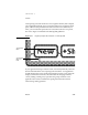
When a user taps a text button or a picture button, the button highlights
(inverts) to give visual feedback to the user that the item has been tapped.
Figure 3-9 shows how several buttons look when highlighted.
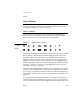
Figure 3-9 Tapping a button highlights it
A button stays highlighted as long as the user continues to press the pen on that
button. When the user lifts the pen from the highlighted button, the action
associated with the button takes place. Your application must continue to
highlight the button until the action is complete. In the case of a button that
displays an ordinary slip (not a status slip), the button stays highlighted only
until the slip appears. In the case of a button that pops up a picker (described
in Chapter 4, “Pickers”), the button stays highlighted as long as any action
initiated by the picker is in progress.
Keeping the button highlighted provides the minimal feedback to the user that
Newton is still working. When an action begun by a button takes more than a
few seconds, your application should provide more feedback by displaying a
status slip that names the action underway (as described in “Status Slips” on
page 2-20).
If your application uses buttons made from system protos, the system auto-
matically adjusts button highlighting in response to a user’s pen movements.
When a user slides the pen away from a highlighted button while still pressing
Not highlighted
H
ighlighted